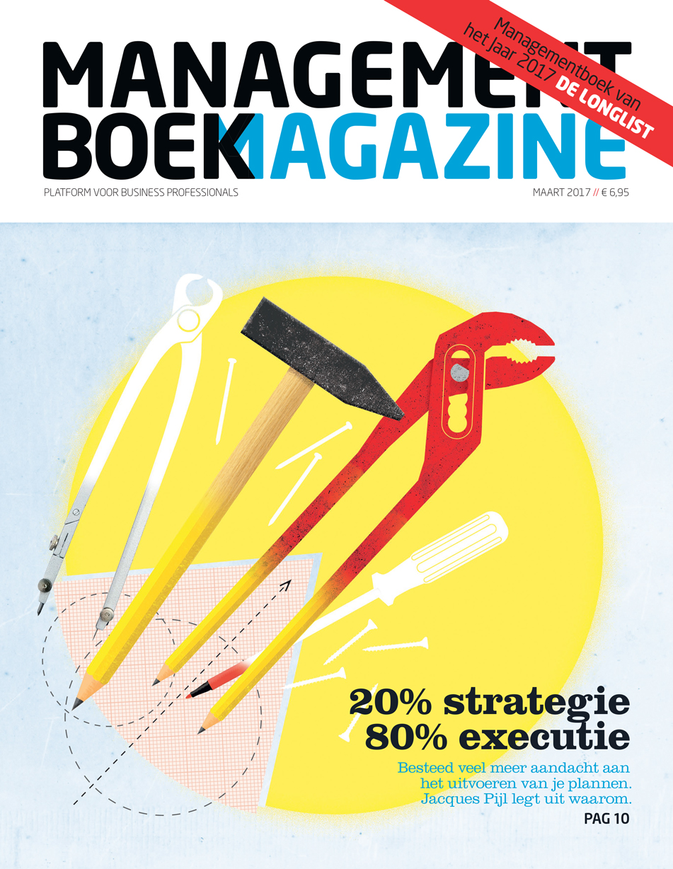
DE HELE BREEDTE VAN HET VAK.
DE HELE BREEDTE VAN HET VAK
Concept, ontwerp, illustratie, copywriting, van eerste krabbel tot gedrukt of online – dat is mijn vak. Maar: elk project begint met een goed gesprek. Of het nou een grote vraag is of een kleine, ik vind het belangrijk om je een keer in de ogen te kijken. Om te leren wat je wilt natuurlijk, maar ook om te weten waar de grenzen éigenlijk liggen, en om de mogelijkheden én onmogelijkheden te laten zien.
Ik ben van vele Marc-en thuis. Maar waar ik zelf vaardigheden tekort kom, schakel ik experts in. Ik ontwerp websites, maar bouw ze niet, bijvoorbeeld. Dat geldt ook voor fotografie: ik maak een aardige foto als het moet, maar ik ken gelukkig flink wat mensen die er, elk op hun eigen manier, écht verrekte goed in zijn. En soms werk ik één op één samen met collega's, en maken we gebruik van elkaars sterke punten.
Hieronder vind je een selectie van mijn ontwerp- en illustratiewerk door de jaren heen. Een aantal projecten en/of opdrachtgevers heb ik nader uitgelicht, om een idee te geven van mijn werkwijze. Yes? Daar gaan we!
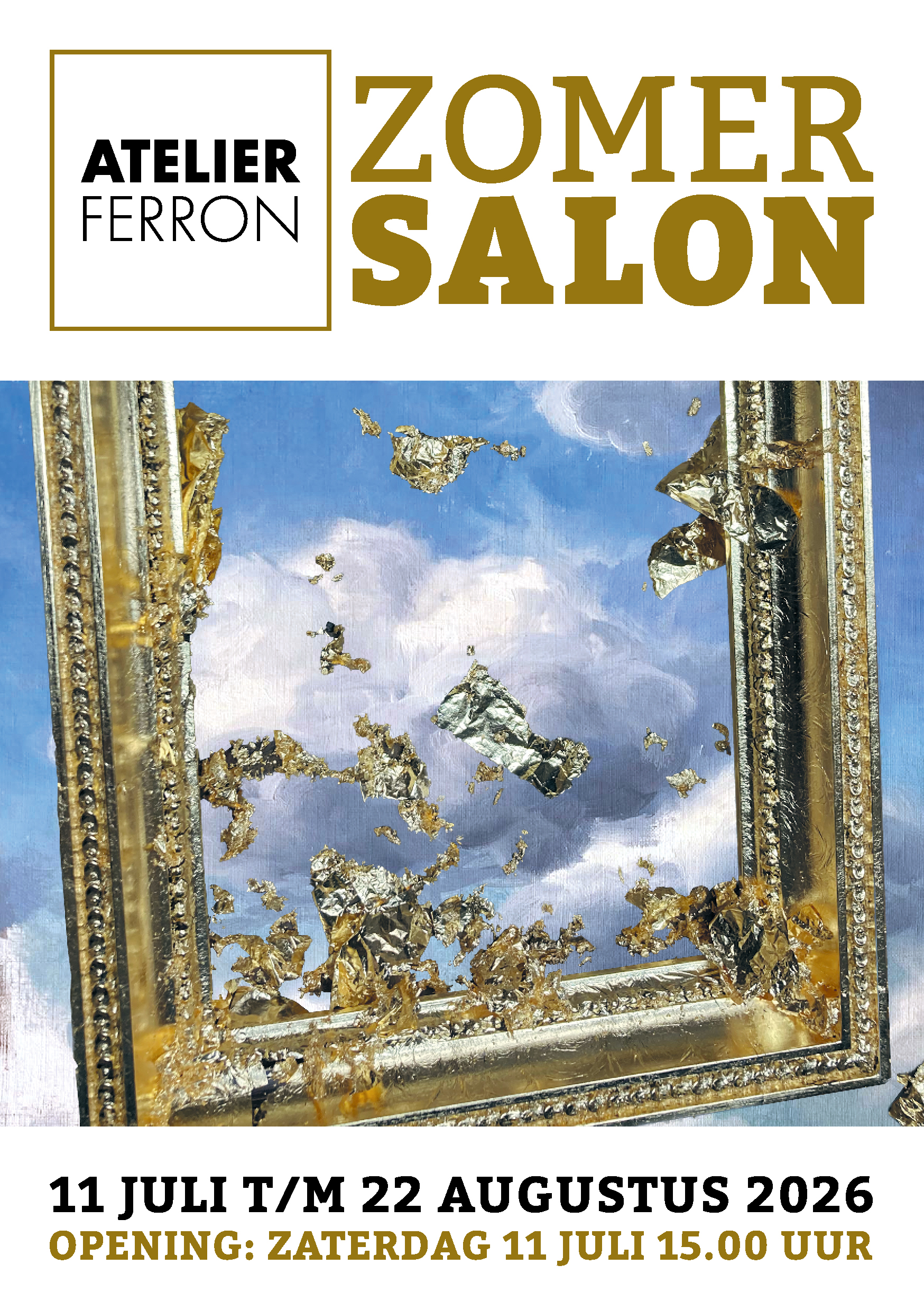
'Mij moet je niks laten organiseren.'
Dertig jaar lang was dat waar – of althans: vertelde ik dat iedereen, mezelf incluis. Tot ik het dit jaar ineens onzin vond, en ik voor en in bevriende galerie Atelier Ferron in Den Haag in een maand tijd een zomerexpositie organiseerde: de Atelier Ferron Zomersalon.
31 kunstenaars leverden 61 kunstwerken aan, en alles liep op rolletjes. Okay, ik hield er een zeer gedetailleerde planning en administratie op na – want ik ken mijn eigen brein inmiddels.
Toen beoogde en benaderde deelnemers enthousiast 'ja, ik doe mee!' riepen, moest ik als een speer het artwork gaan maken... Gelukkig is Atelier Ferron óók een lijstenmakerij (vandaar de vergulde lijst), en was deelnemend kunstenaar Maarten Demmink bereid een door hem geschilderde zomerse wolkenlucht te doneren.
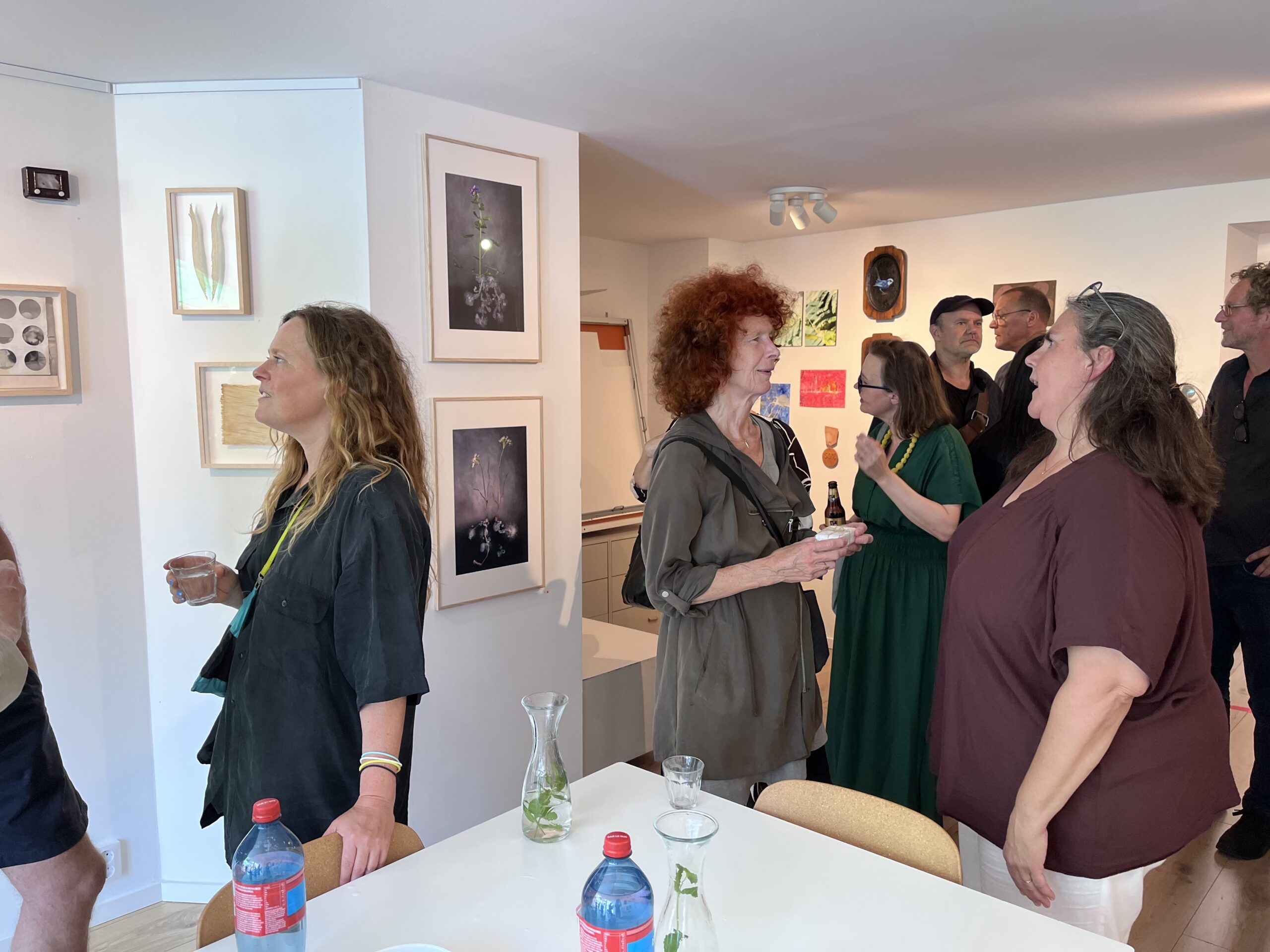
Maar het belangrijkste element in de organisatie was misschien wel de communicatie richting de deelnemers zelf: van uitnodiging tot aftersales een consequente, positieve toon, met heldere – en waar nodig herhaalde – informatie en updates over de stand en gang van zaken. En een beetje humor!
Dat iedereen de Atelier Ferron Zomersalon er als tentoonstelling geweldig uit vond zien is te gek natuurlijk; maar dat ik complimenten kreeg voor m'n mailcommunicatie was wel extra leuk. Waarom?
Omdat ik – en dat is een door copywriters te weinig toegepast óf te goed bewaard geheim – gewoon schrijf zoals ik praat: van mens tot mens.
Strategie? Nee: common sense. Spreek gewoon met je doelgroep zoals je zelf bent, niet zoals jij denkt dat zij verwachten dat je praat.
Onthoud dat maar voor communicatie in woord en beeld: van mens tot mens = common sense.
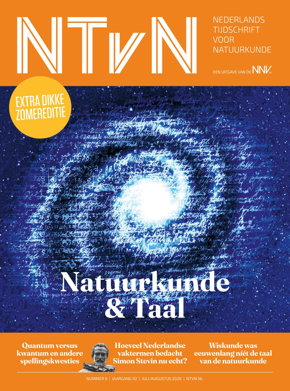
Het Nederlands Tijdschrift voor Natuurkunde is gerestyled – niet door mij, helaas – en het ziet er geweldig uit. Ik had wel de eer om voor deze allereerste vernieuwde editie de coverillustratie te maken bij het thema Natuurkunde & Taal. Taal! Alsof het zo moest zijn...
Hoe dan ook: het sterrenstelsel is een collage van handschriften van een paar van de beroemdste fysici uit de geschiedenis. Dichter kreeg ik natuurkunde en taal niet op elkaar: in den beginne was het woord?
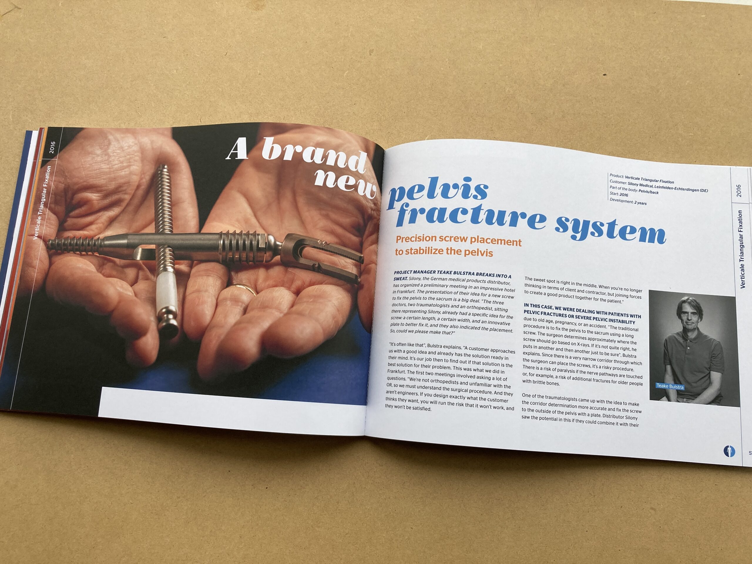
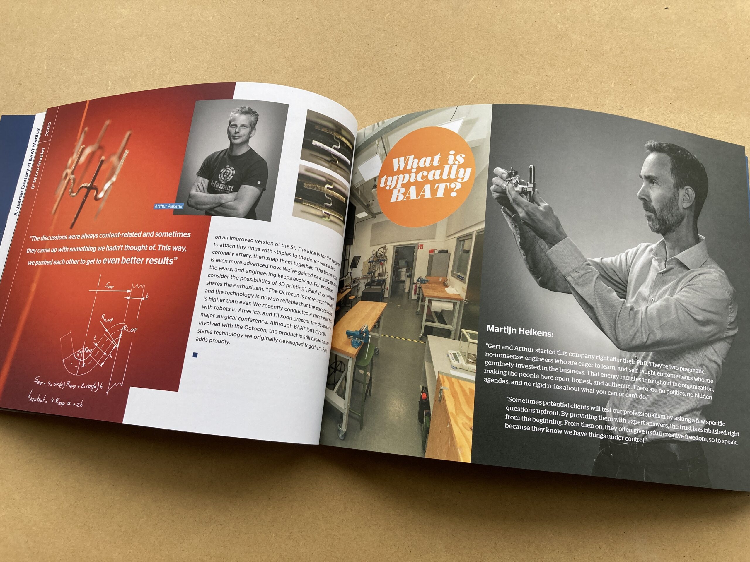
Innovatieve medische technologie is vooral... mensenwerk.
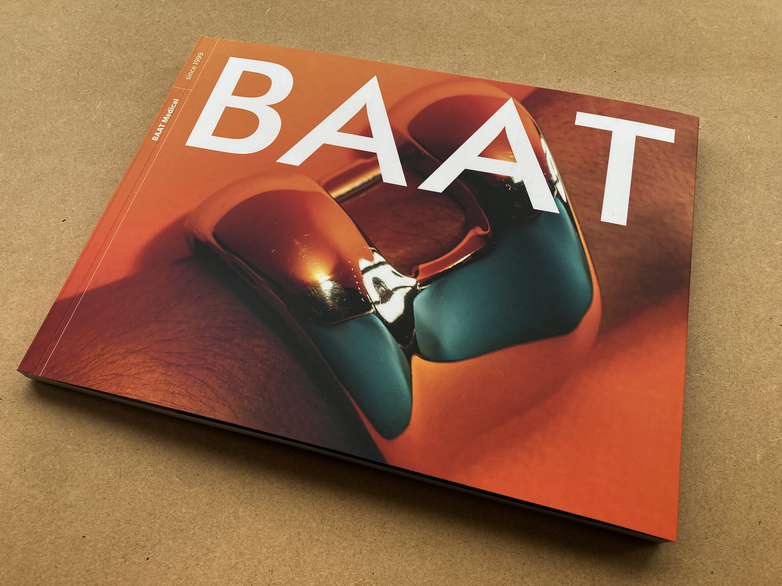
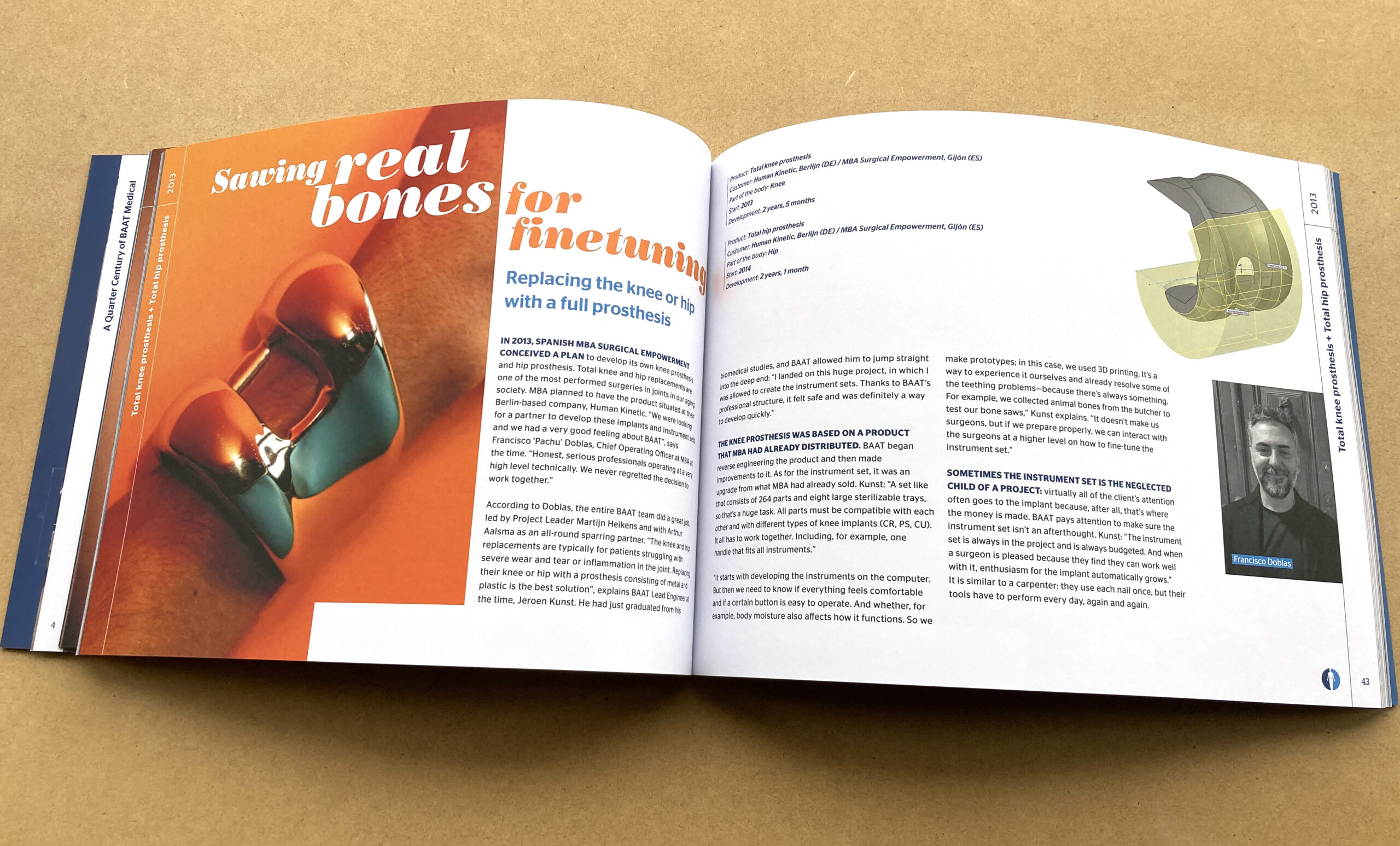
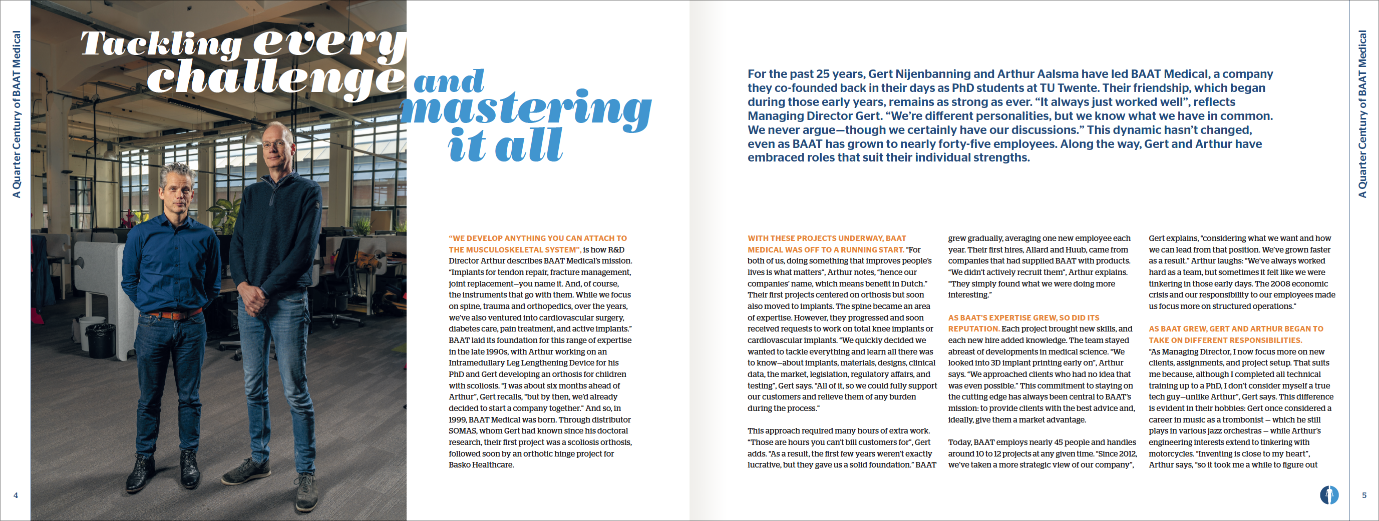
BAAT Medical in Hengelo is gespecialiseerd in het ontwerpen van zeer innovatieve medical devices, zoals implantaten en chirurgische instrumenten. BAAT bestond 25 jaar en wilde dat jubileum vieren door een boek te laten maken met de baanbrekendste projecten uit hun bestaan. Voor zichzelf, maar ook voor hun klanten.
Ik werk intuïtief. Met de eerste foto's en teksten maakte ik al snel de keuze voor een speelse titeltypografie. Bijna het tegenovergestelde van wat je zou verwachten bij een boek over medische technologie: enige research leerde me dat de meeste bedrijven in de medische branche, net als BAAT zelf, opereren in blauw en groen. De product- en portretfotografie van Edwin Smits had ook als uitgangspunt dat de technologie uiteindelijk echte mensen ten goede komt, maar ik wilde meer dan alleen speelsheid. Ik voegde met een oranje gradient en een subtiel kleurverloop van het BAAT-blauw naar een donkerder variant ook warmte toe. Edwin liet die kleuren dan ook terugkomen in zijn fotografie.
Warme kleuren bleek een goed idee. Want naarmate het project vorderde en er meer teksten binnenkwamen, bleek het boek eigenlijk te gaan over de mensen achter de uitvindingen. De eerste ideeën van chirurgen, de geniale outside-the-box oplossingen, de gezonde ambitie om het leven van patiënten te verlichten, de ongelofelijke individuele expertises, en uiteindelijk het overduidelijke gegeven dat medische innovatie vooral teamwork is – dat verdiende een aantrekkelijk, warm en vooral menselijk boek. En toch - die uitvindingen... poe!
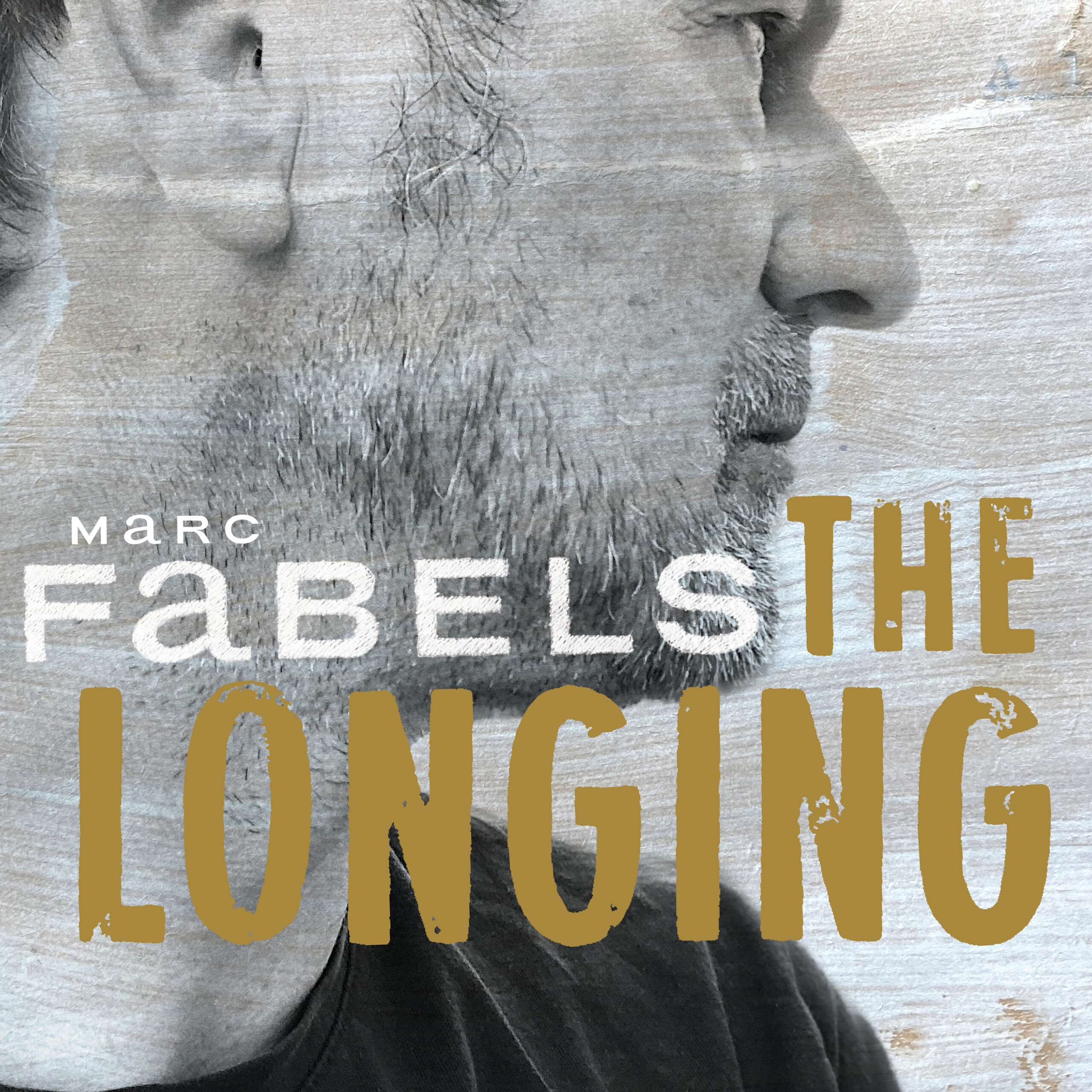
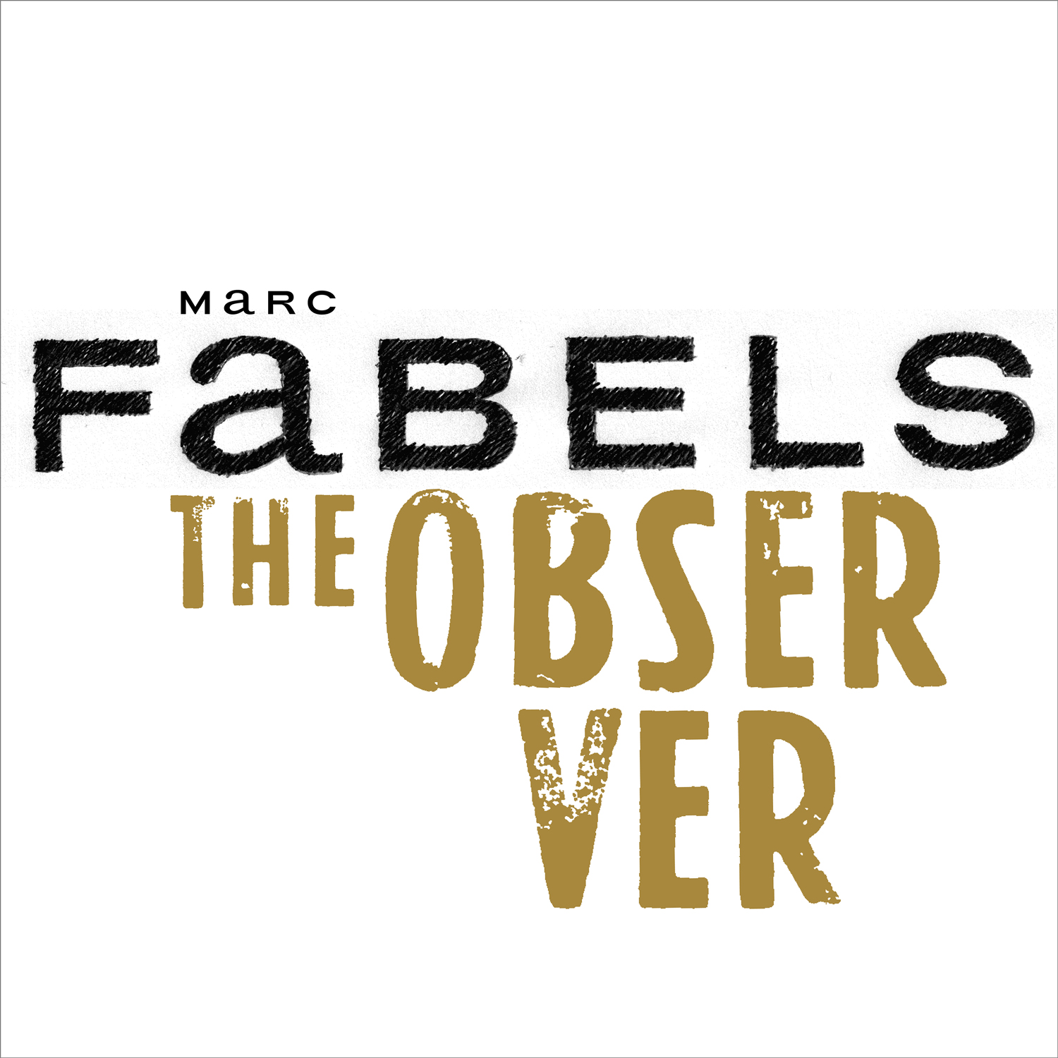
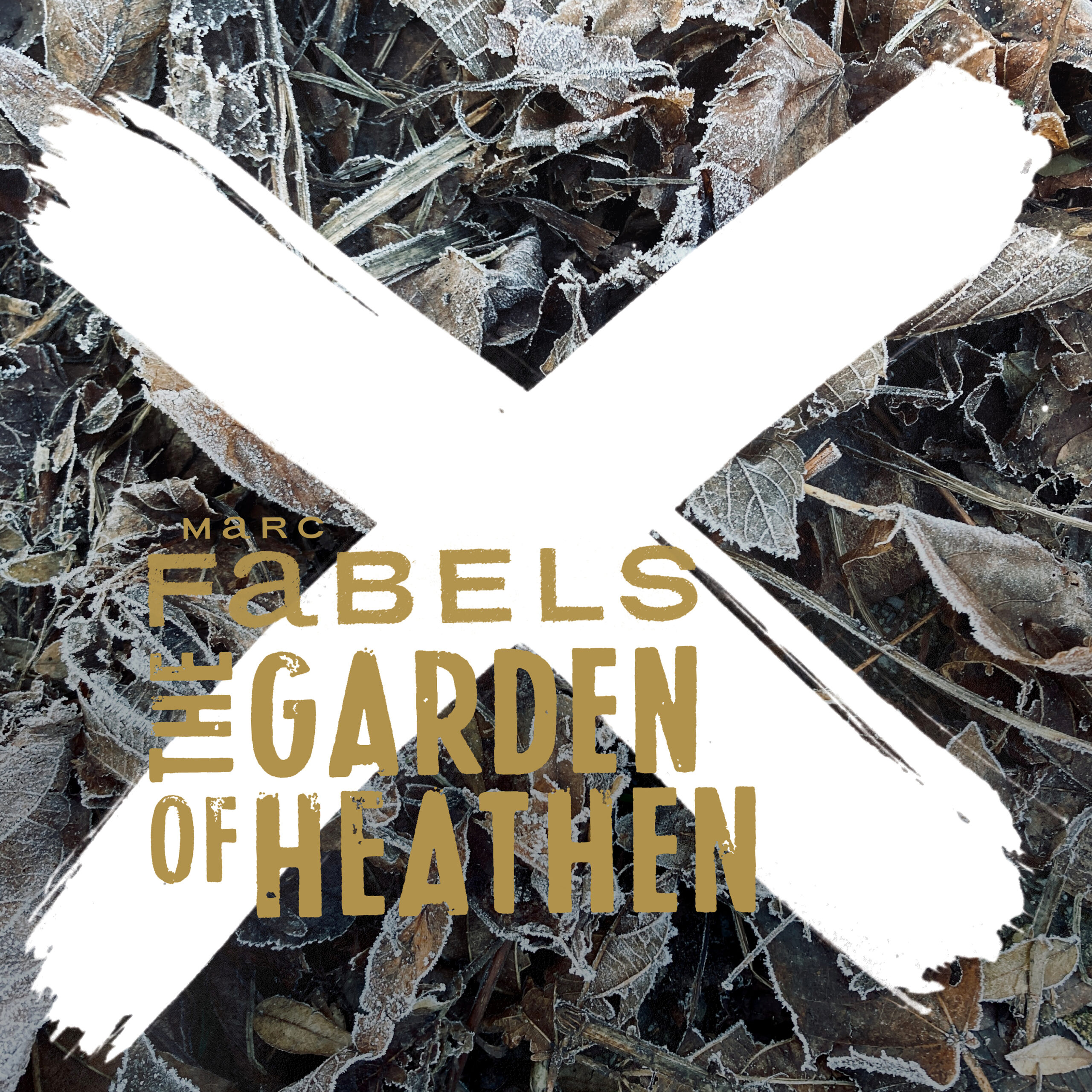
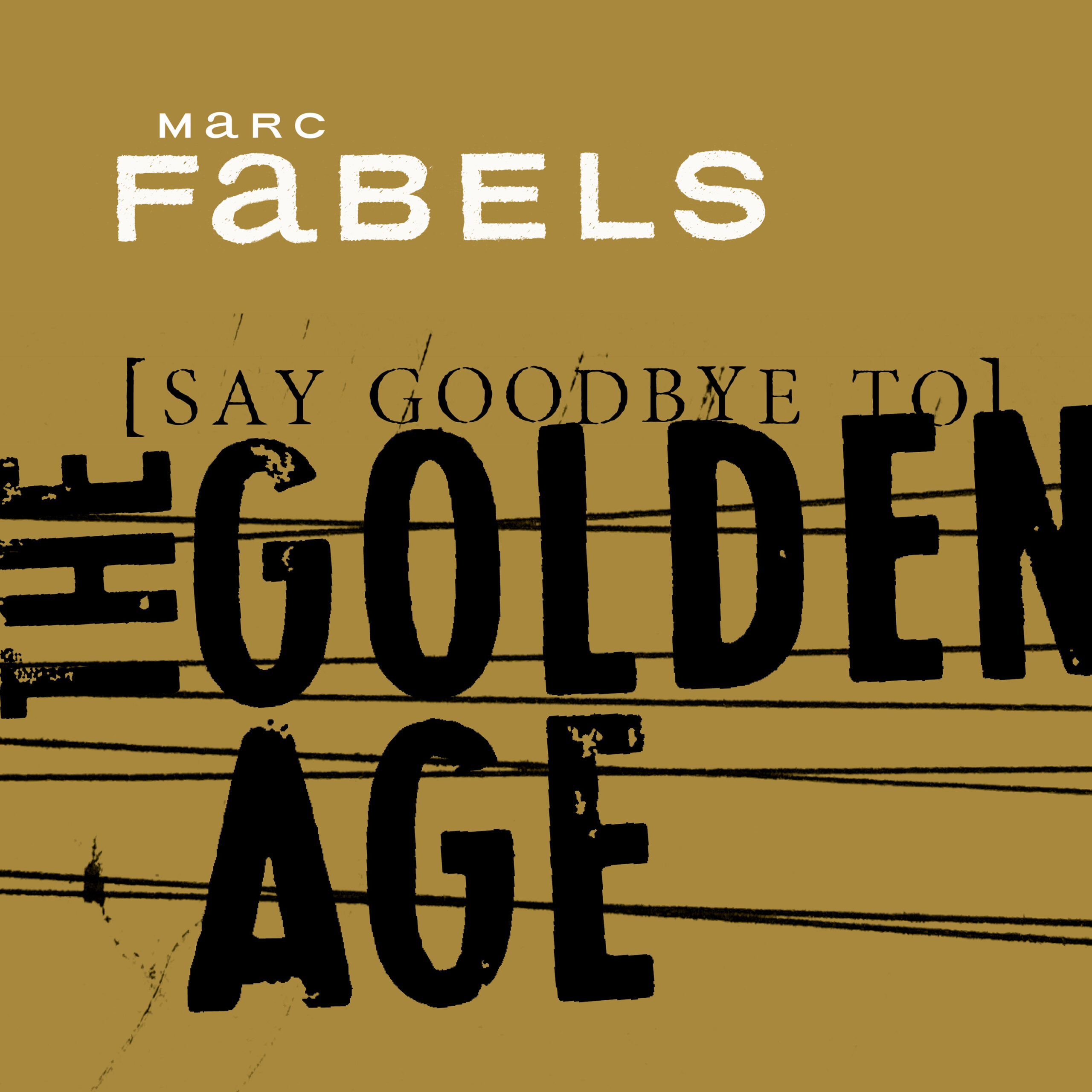
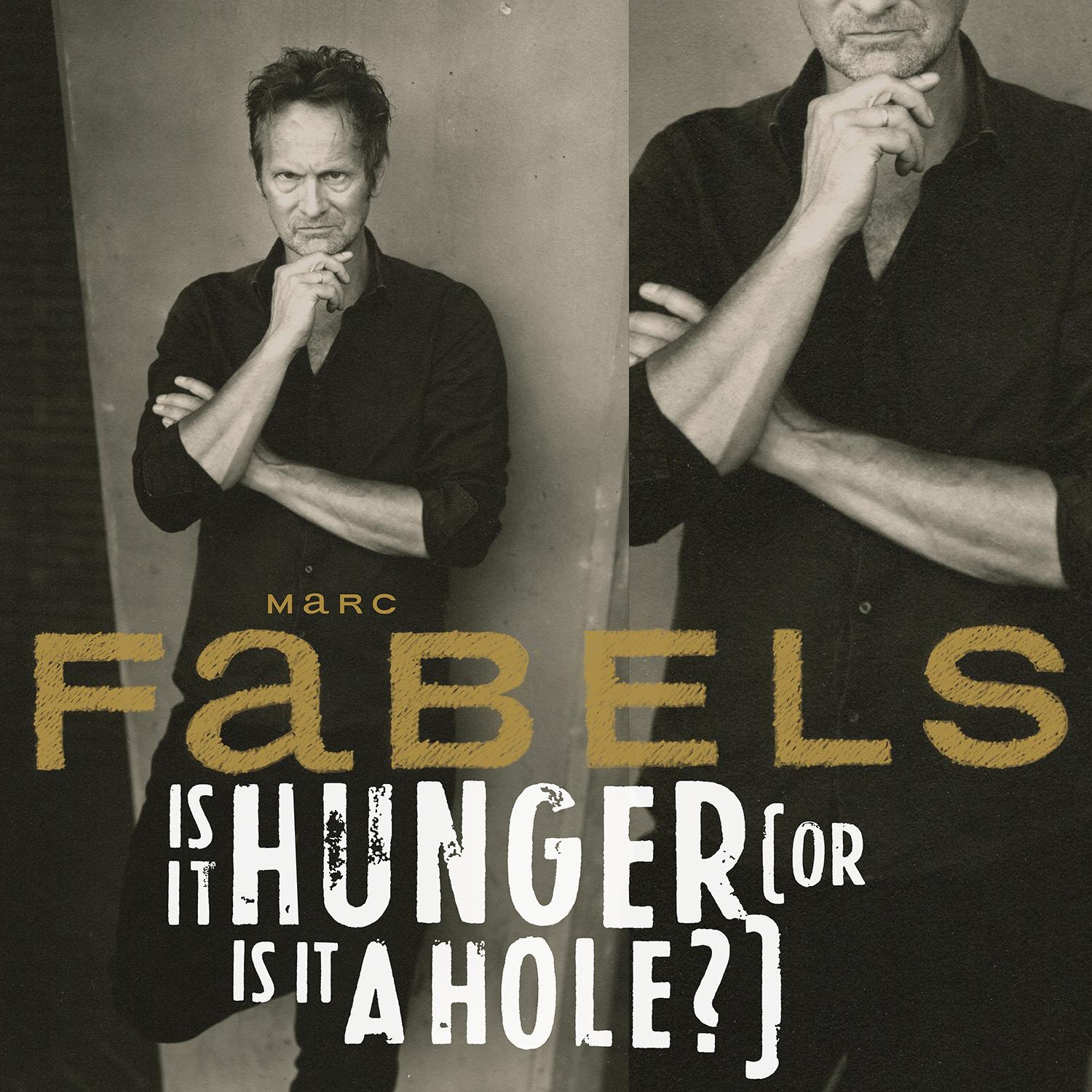
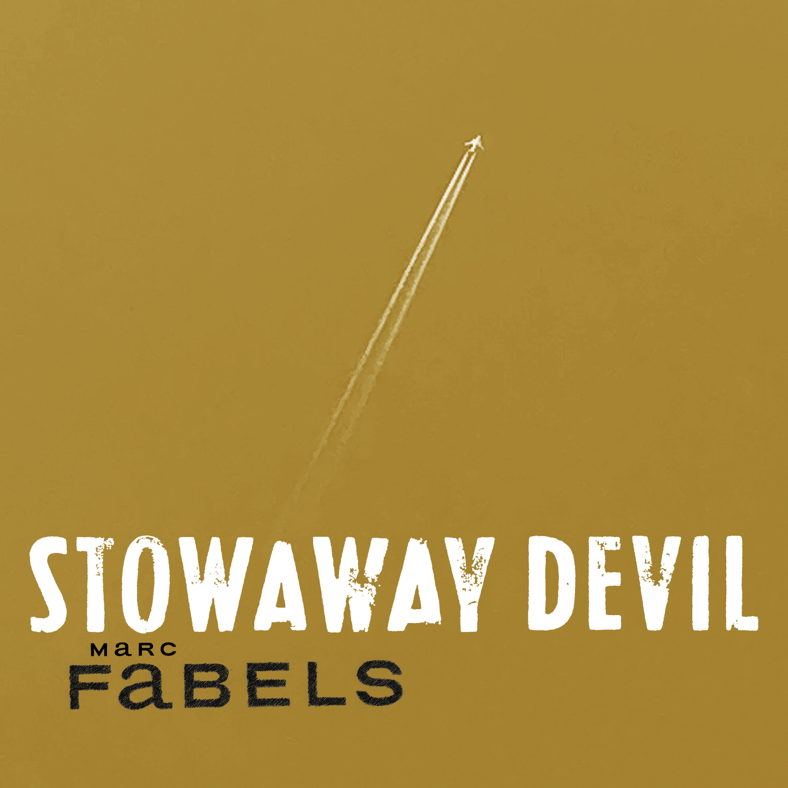
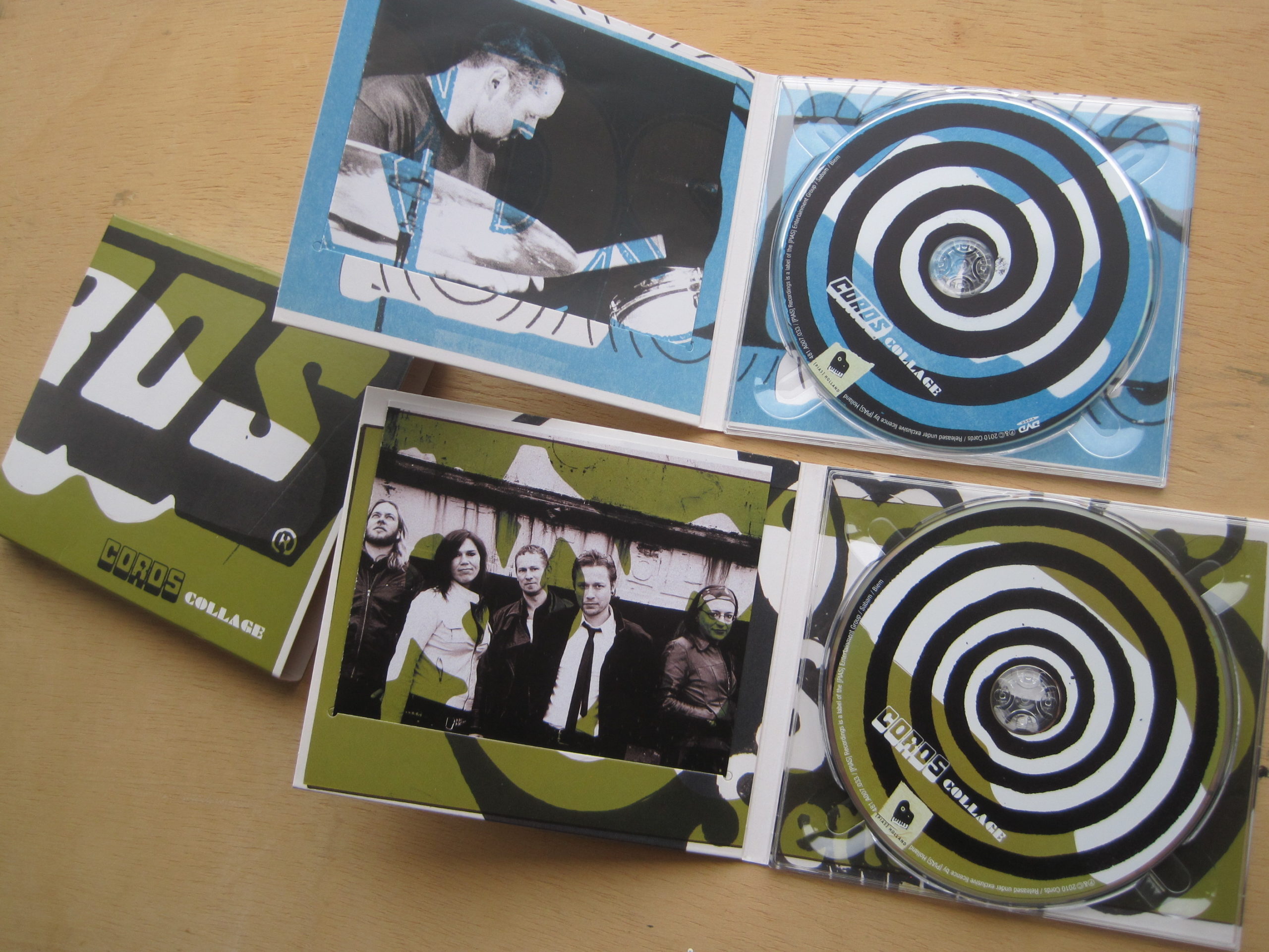
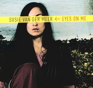
Ontwerpen voor mijn eigen muziek. Ik zoek naar variatie en evolutie binnen een consistente visuele identiteit. Portretfotografie van de EP (rechtsboven) door fotograaf Bert Teunissen. Hieronder de video die ik maakte (filmen, montage) bij mijn song The Observer. Meer video's op mijn muziekpagina.
Ruigrok: de kunst van harde data aantrekkelijk maken
Ruigrok: de kunst van harde data aantrekkelijk maken
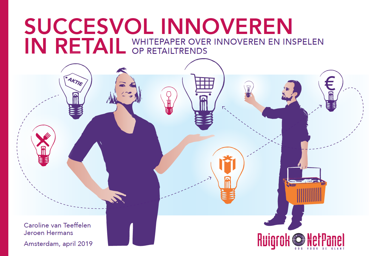
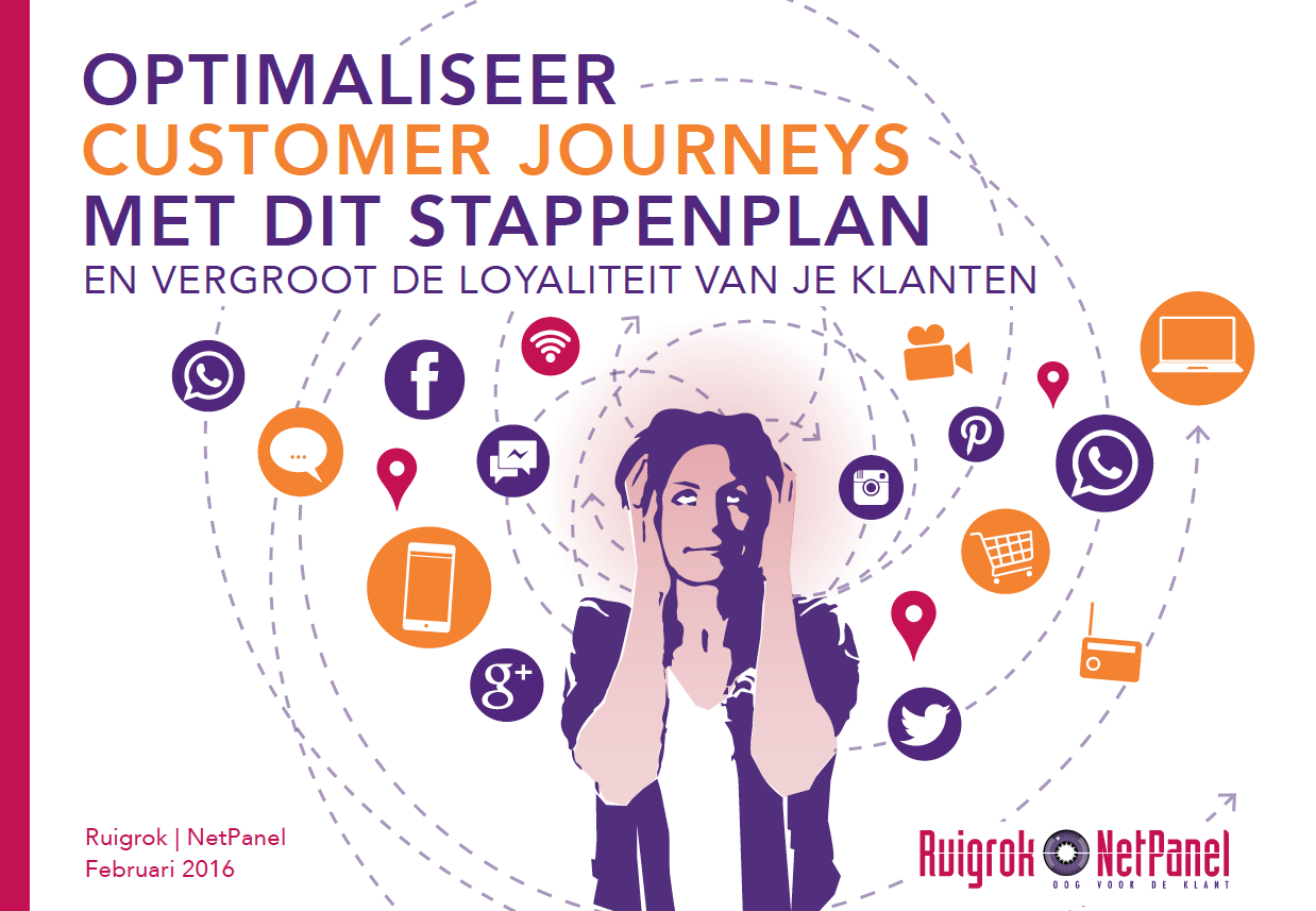
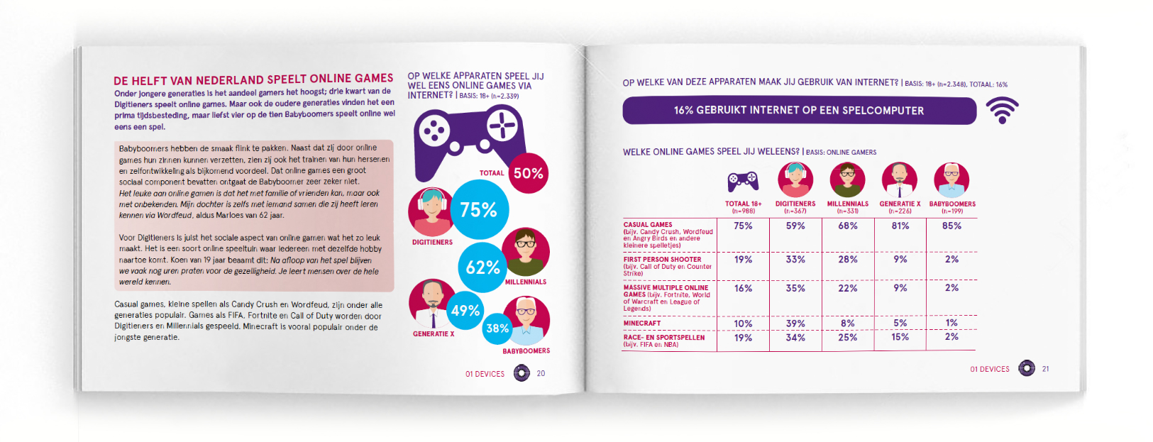
Voor marktonderzoeksbureau Ruigrok gaf ik vorm aan de jaarlijkse rapporten van hun bekende, langlopende onderzoek What's happening online? en aan een flink aantal whitepapers. Dat vergt de kunst om harde data en informatie aantrekkelijk en leesbaar te maken – zonder het wetenschappelijke karakter te verliezen.
Het eerste wat ik deed was twee extra, bij het donkere rood en blauw (toen) van Ruigrok passende kleuren durven voorstellen: een helder blauw en een fris oranje. Dit bracht meer diepte in pagina's, typografie en illustraties, zorgde voor wat vrolijkheid, en het belangrijkste: sommige infographics werden er leesbaarder en dus duidelijker van. Op de covers van de jaargangen What's happening online? speel ik met de kleuren en gebruik ik de in principe strakke typografie speels. Je moet zin krijgen om te lezen, nietwaar?
Voor de coverillustraties van de whitepapers vond ik de perfecte mix van realistisch en gestileerd beeld, met altijd de mens centraal. In die stijl kon ik de inhoud van de whitepaper tegelijk conceptueel en speels weergeven, zonder de zakelijke uitstraling te verliezen. En ja, die lastige concepten uitbeelden: heerlijk werk!

Het kerstpakket voor collega-zzp'ers, een hele tijd geleden. Lol hebben met het concept en de zeer consistente copywriting – een soort mini-campagne. De Molotovcocktail was uiteraard een fles wodka; brainfood (and/or) go nuts was een zak met walnoten, de boekband met kiss and tell (and/or) burn after reading bevatte mijn kleine prozabundeltje met het schuurpapieren omslag.
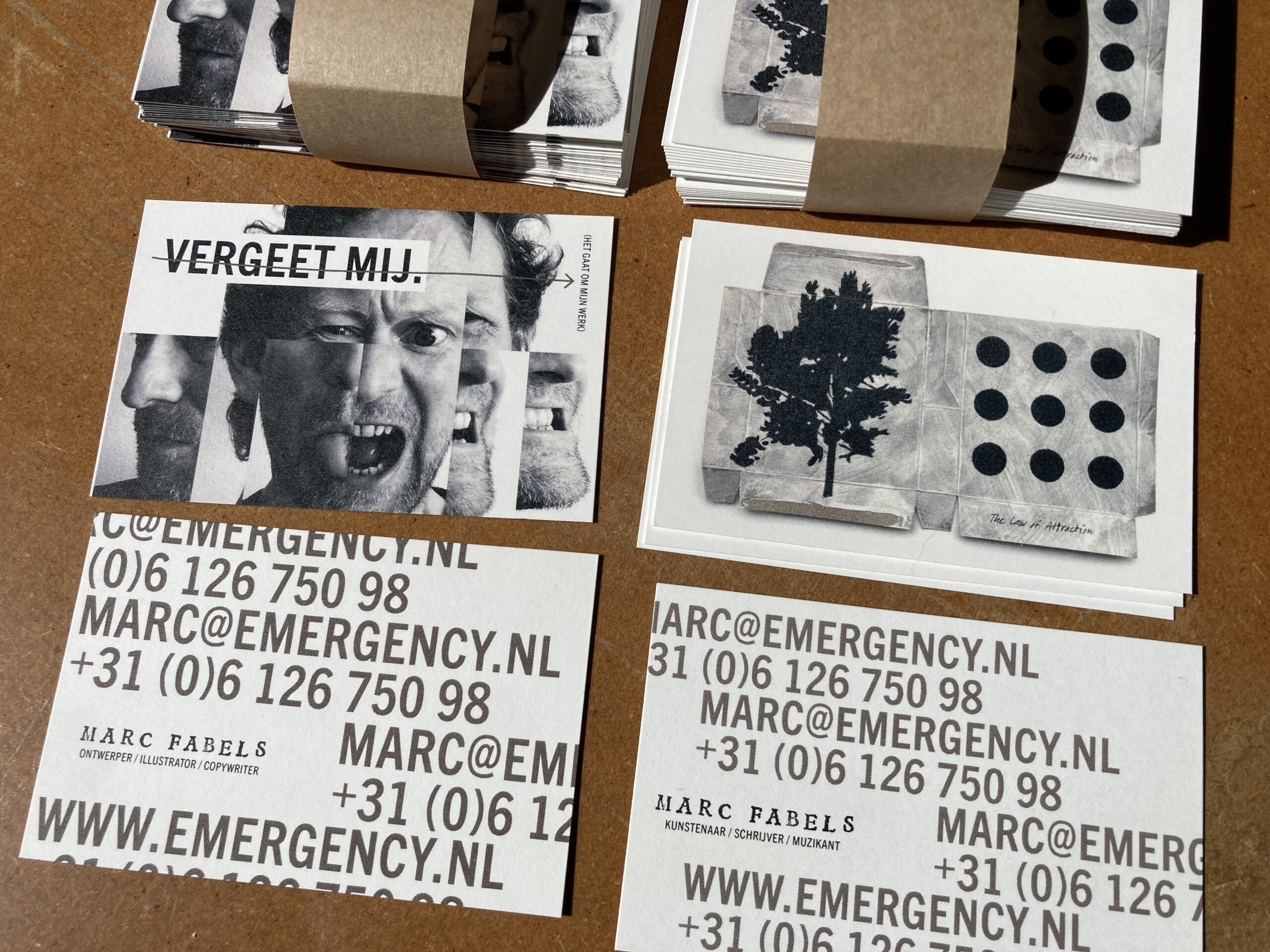
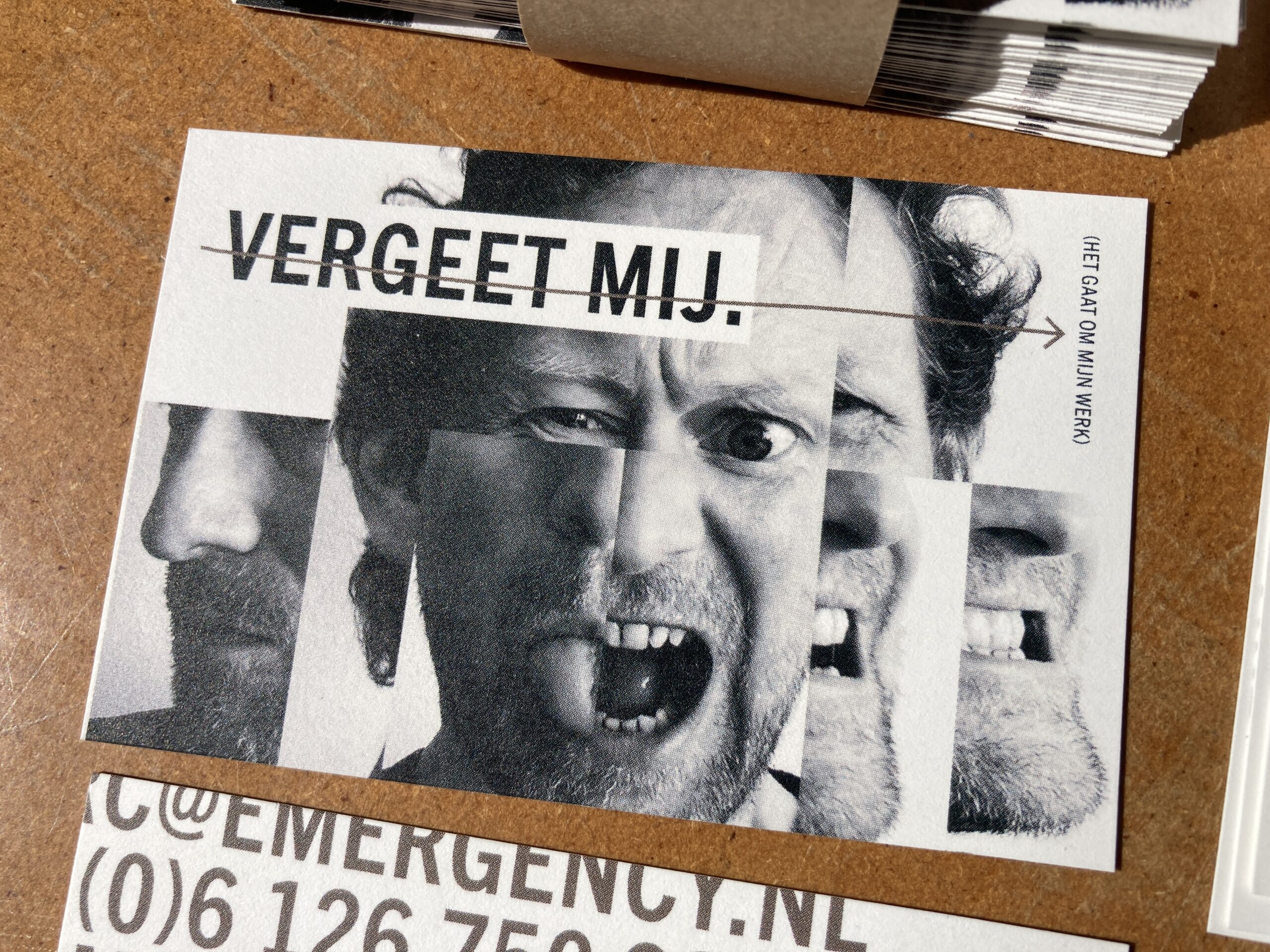
Mijn nieuwe business cards! Spaar ze alle twee! (maar zie ook het concept...)
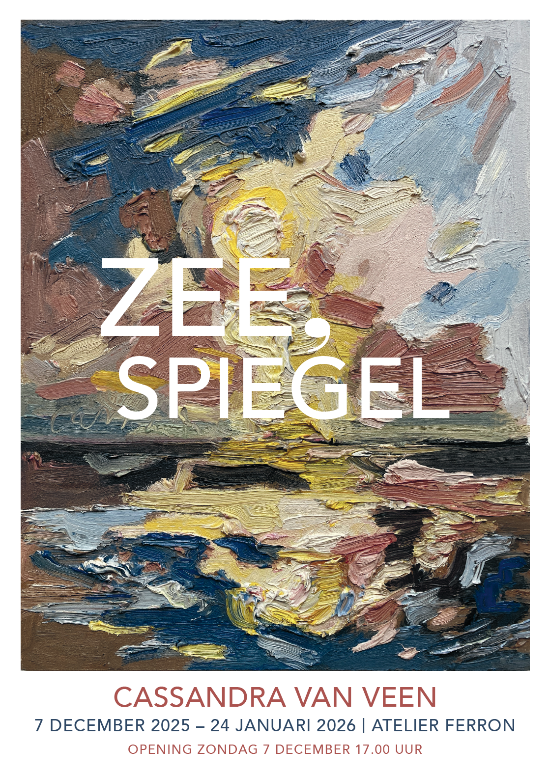
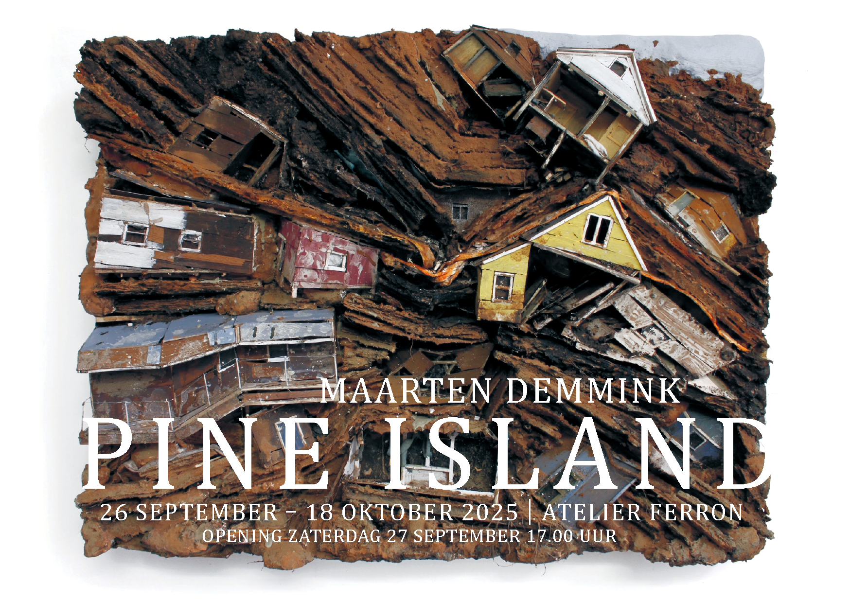
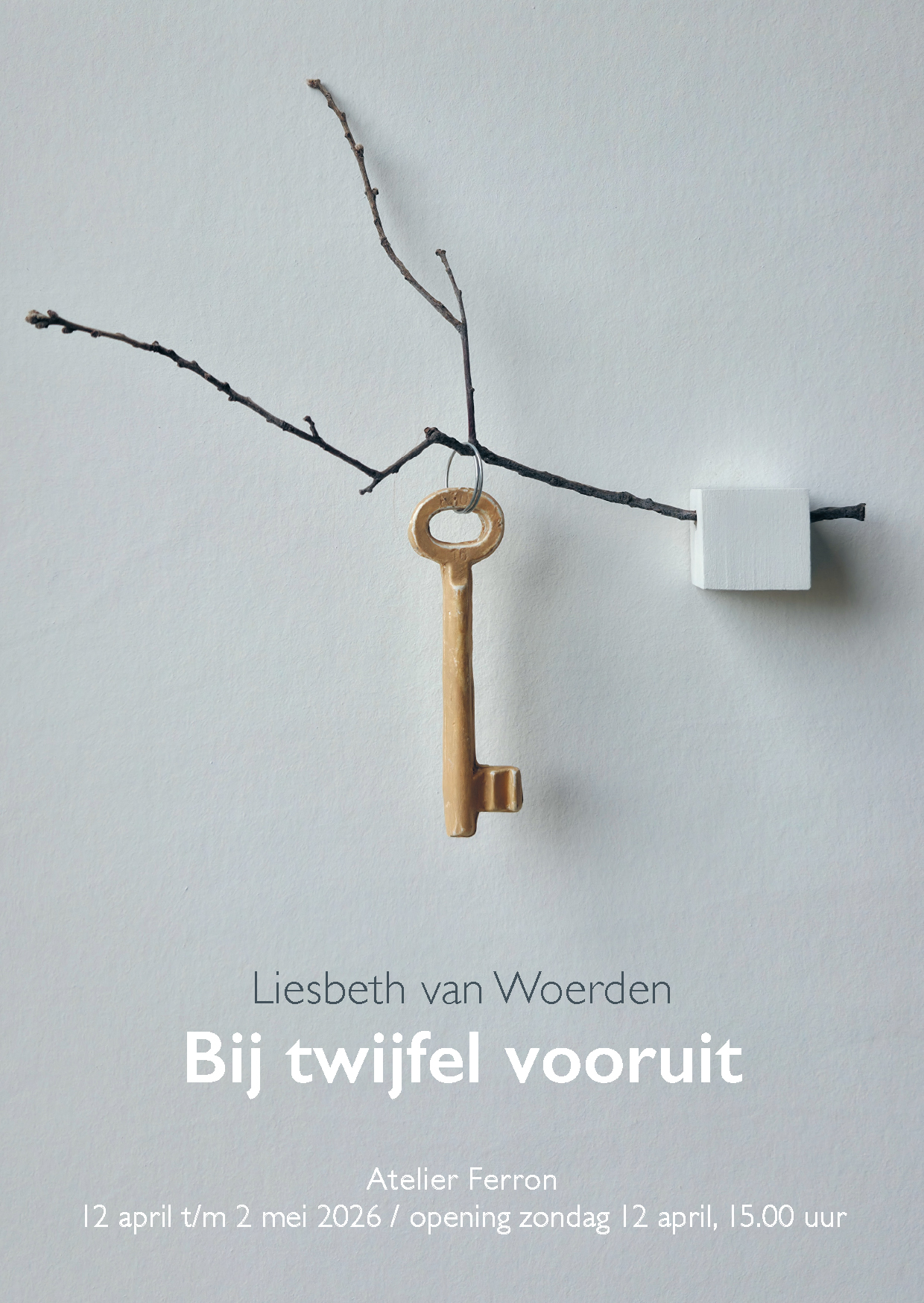
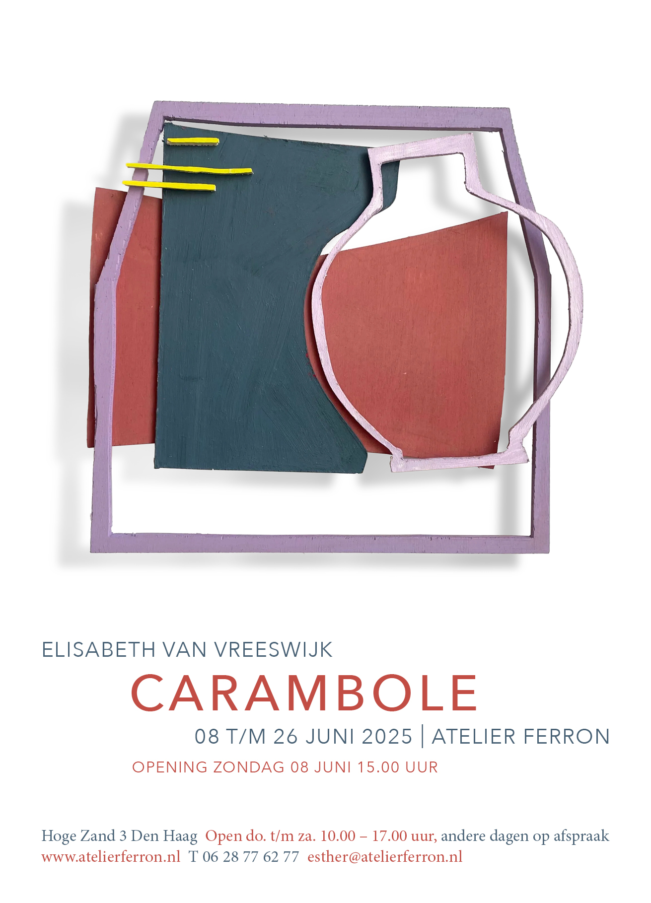
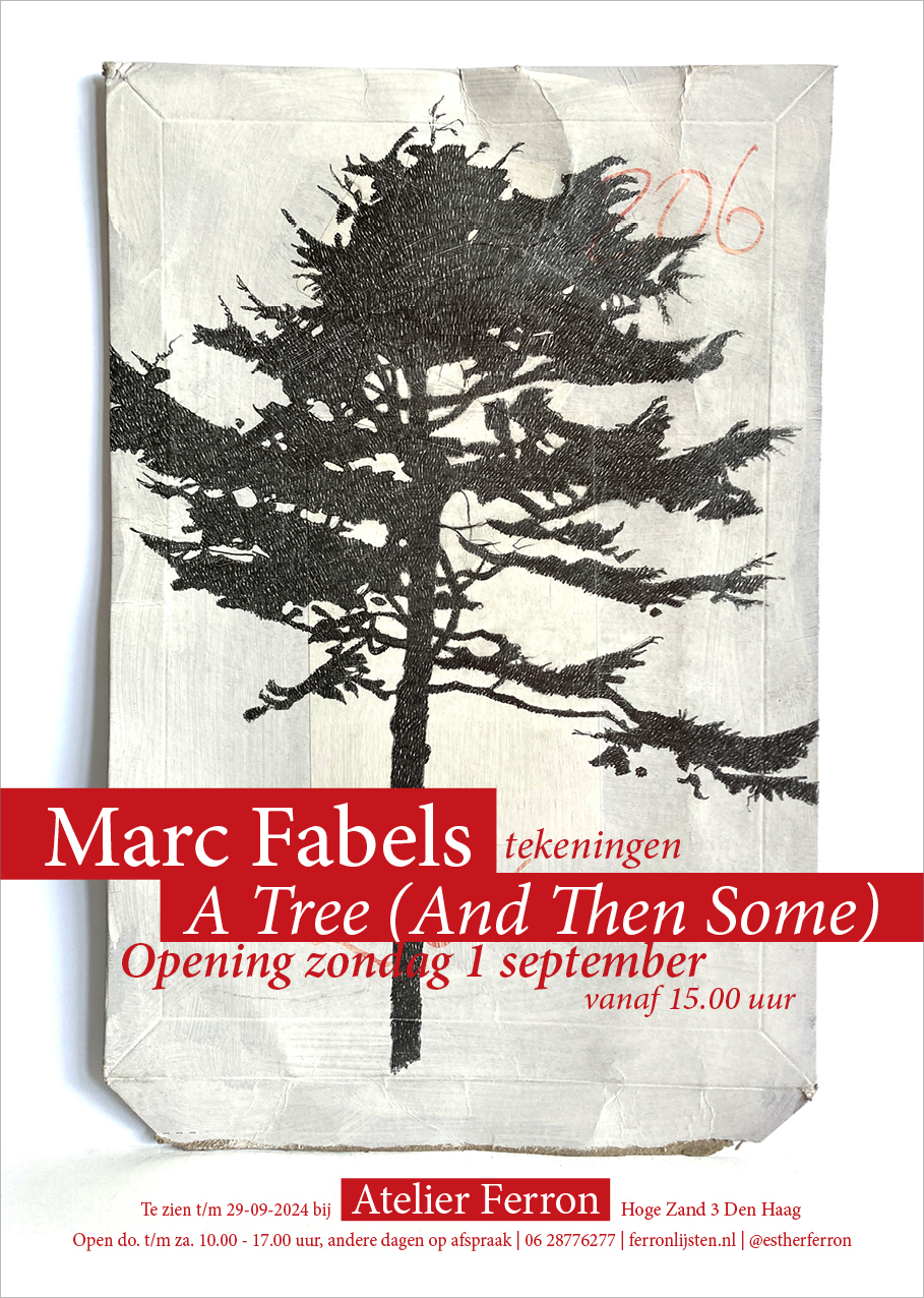
Een serie uitnodigingen voor tentoonstellingen, A5 en A6, voor bevriende Haagse galerie Atelier Ferron. De uitnodiging doet altijd recht aan de kunstenaar en diens werk; voor mezelf dus wat stevige keuzes, voor anderen een rustiger en meer typografische aanpak. Soms verzin ik ook de titel van andermans tentoonstelling (Zee, spiegel bijvoorbeeld) en schrijf ik de copy voor kaart en website.
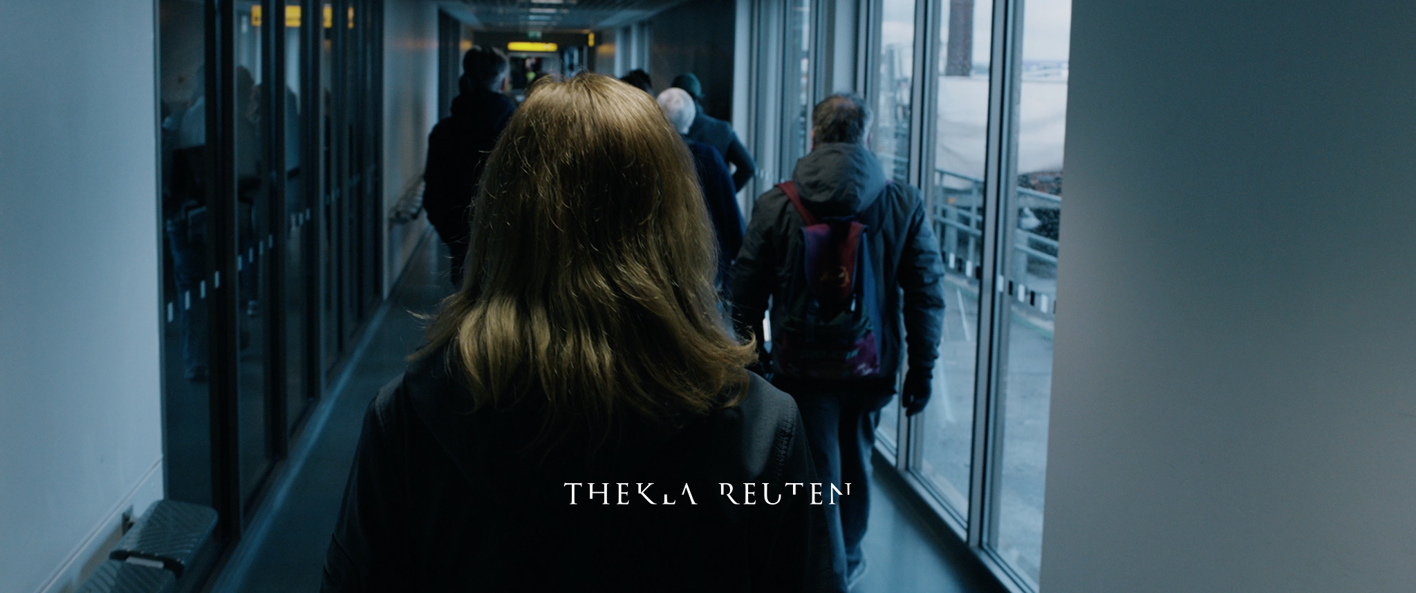
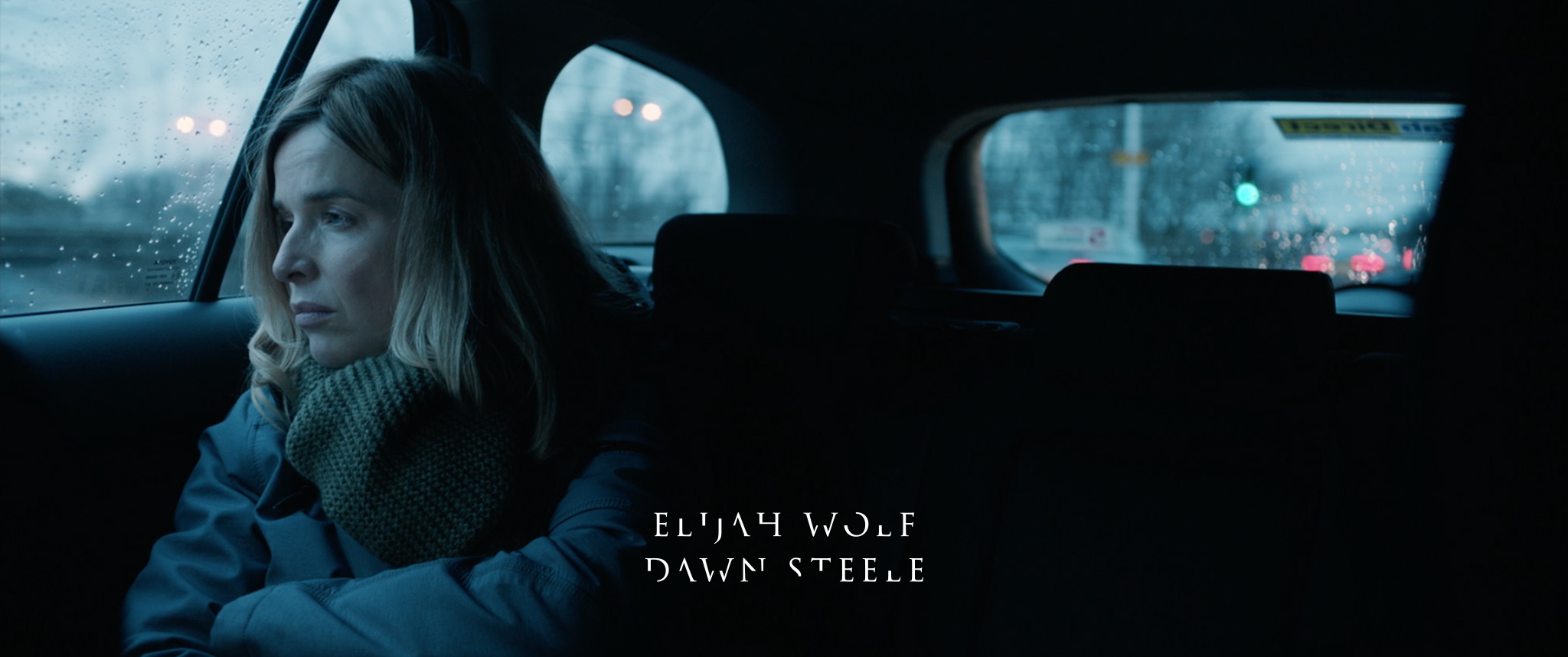
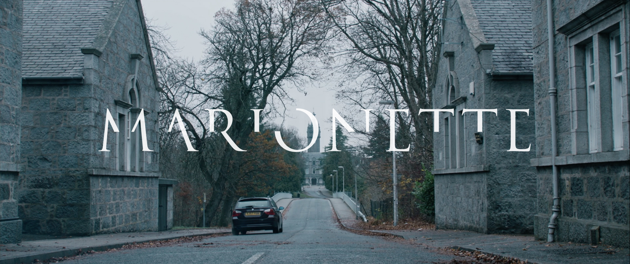
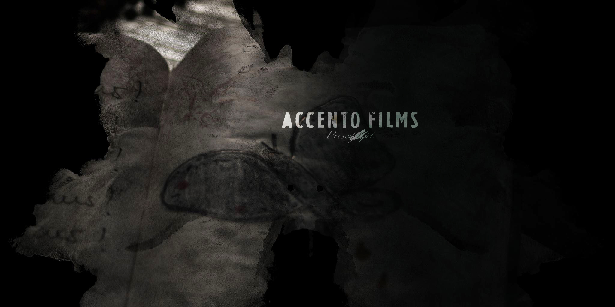
Title design voor de feature film Marionette van schrijver-regisseur Elbert van Strien, een psychologische thriller met horrorelementen. De gaten in de typografie geven zowel het selectieve geheugenverlies van de hoofdpersoon (gespeeld door Thekla Reuten) weer, als de mind games die er met de kijker worden gespeeld. En nog steeds leesbaar!
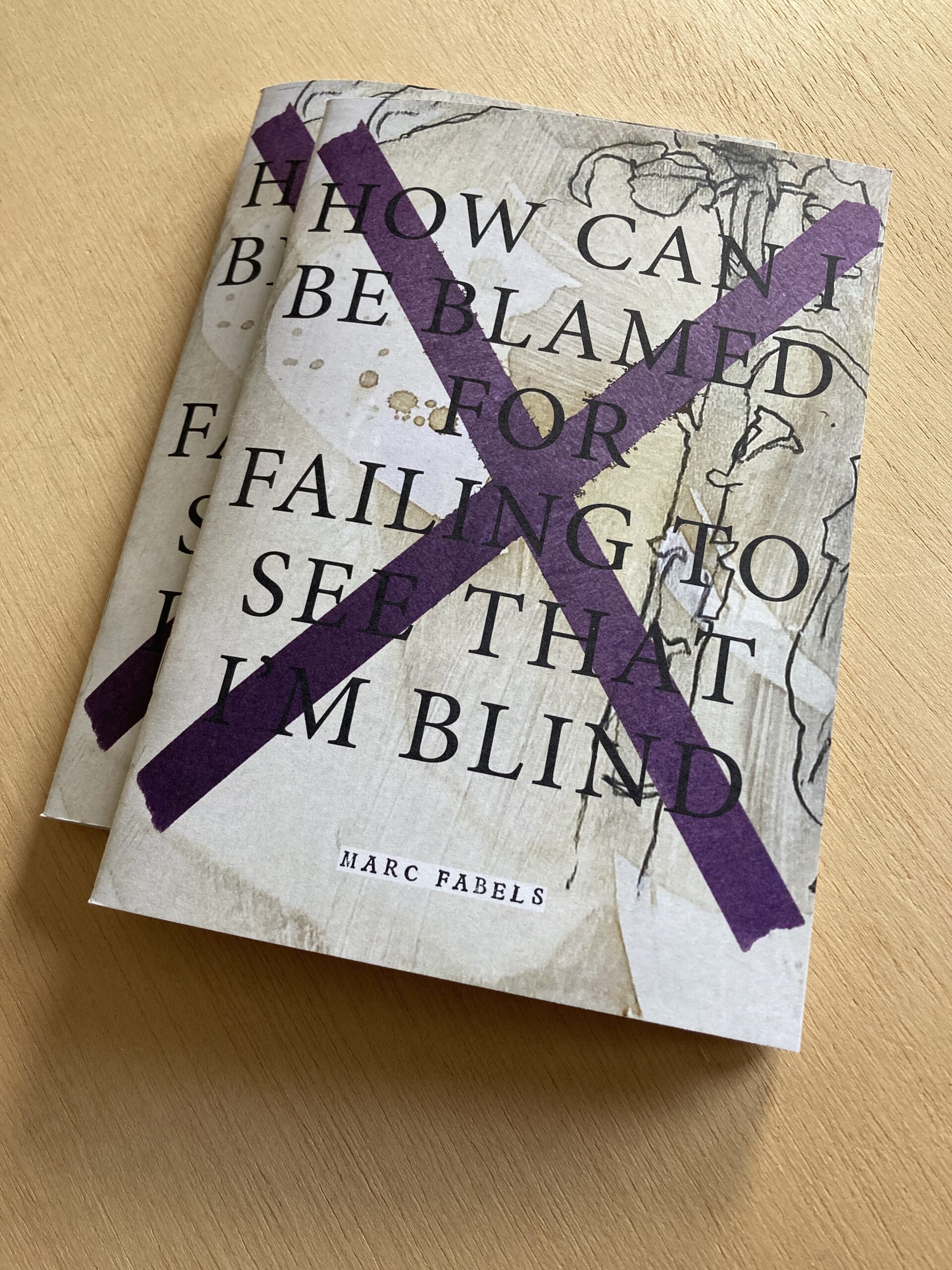
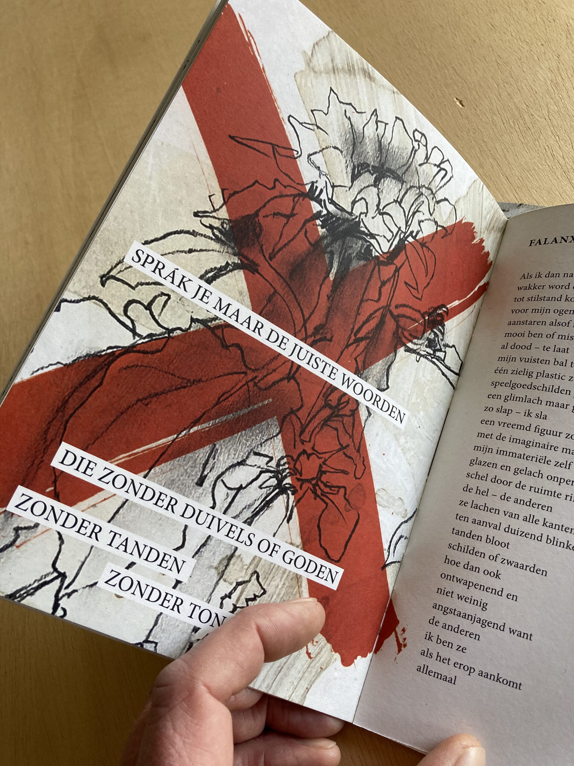
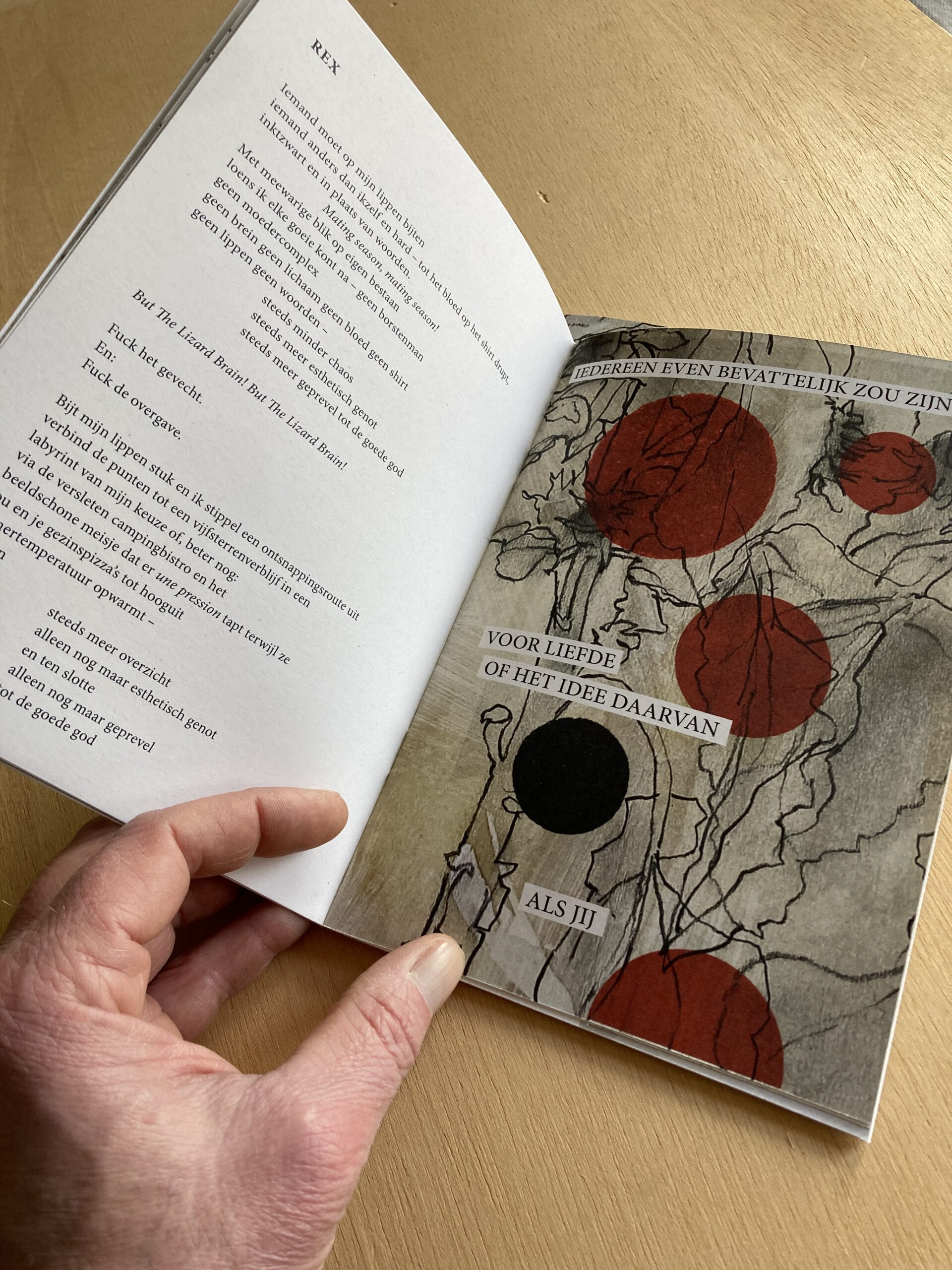
Ontwerpen, tekenen, schrijven – hier komt het samen in mijn bundel met tien gedichten plus één.
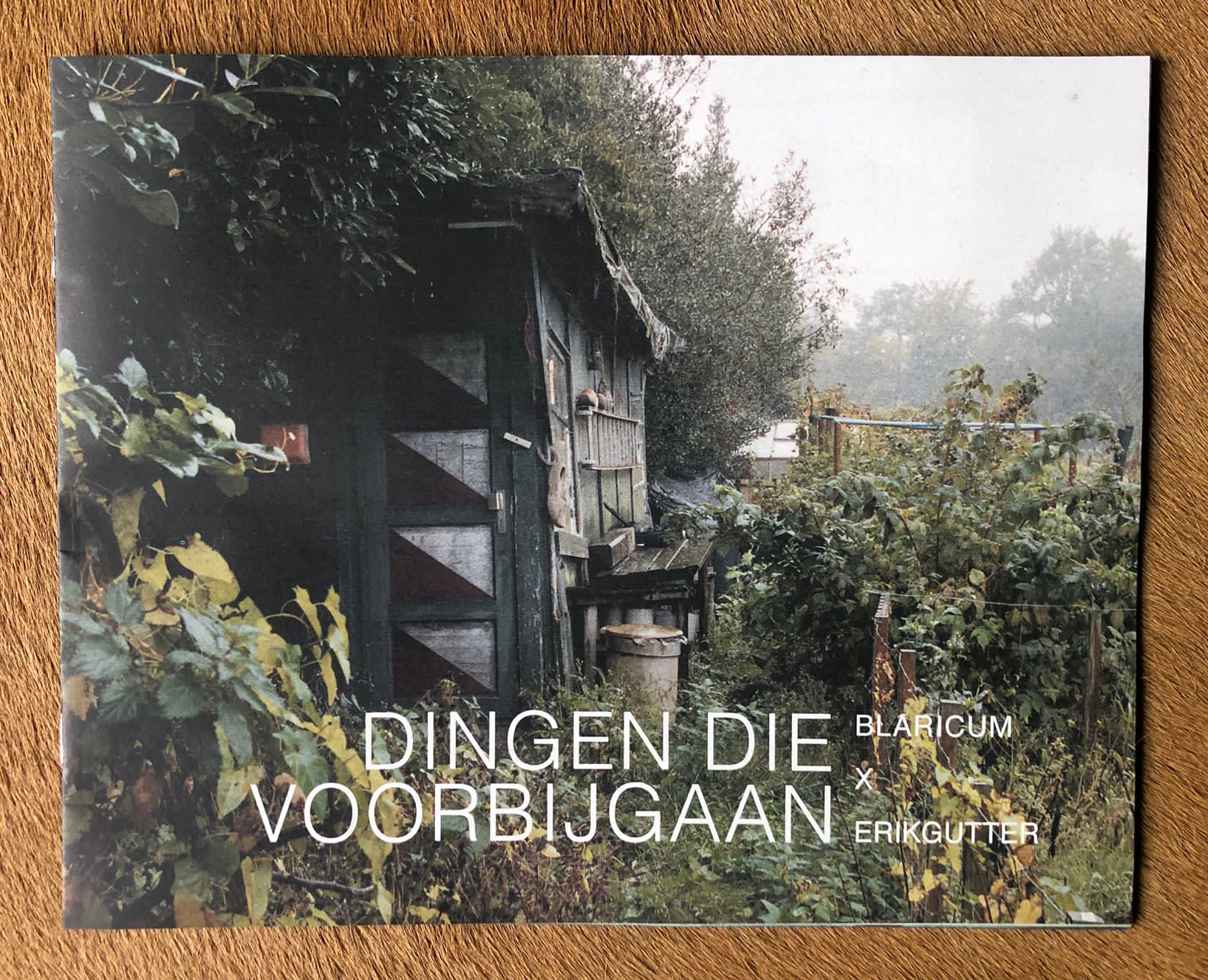
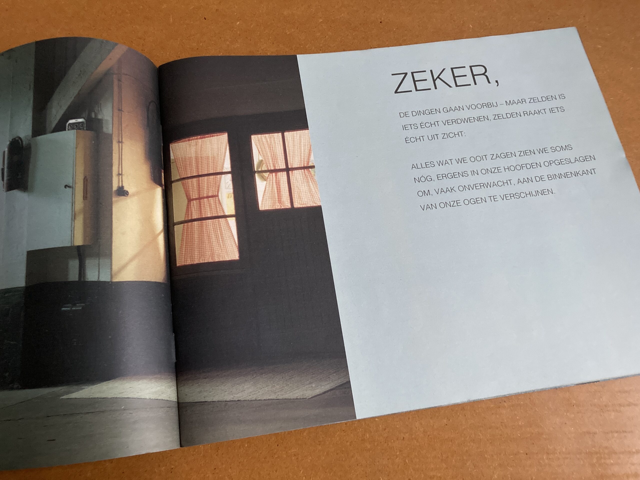
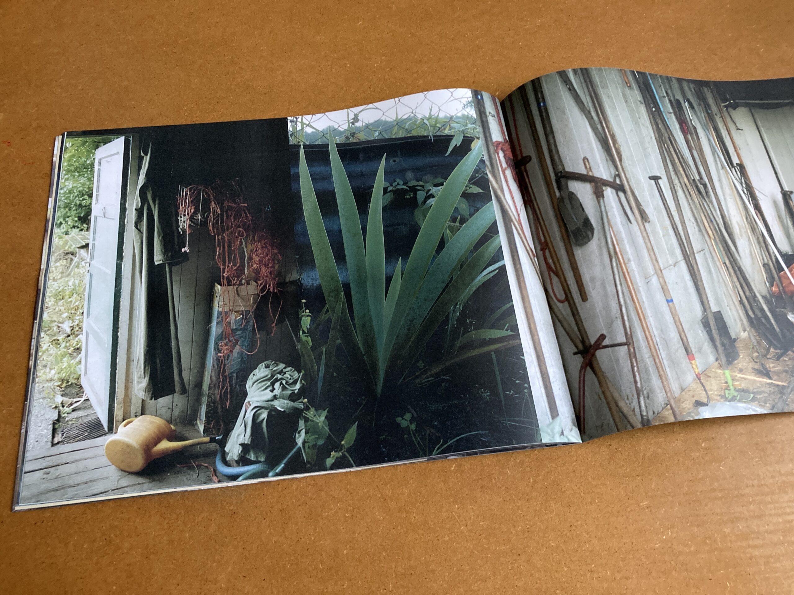
Ontwerp en copywriting van een foto-zine voor en samen met interieurontwerpers StudioErikGutter, met foto's van fotograaf Bert Teunissen van een verdwijnend (en in sommige gevallen al verdwenen) Blaricums dorpsleven. De tekst is mijn poëtische (maar op feiten gebaseerde) interpretatie van de dankbaarheid die StudioErikGutter hun trouwe clientèle wilde betonen bij het noodgedwongen verlaten van hun winkelpand; namens hen blik ik tegelijk terug en kijk ik vooruit naar nieuwe avonturen.
Beeldmerkontwerp voor n.0, een ooit gepland society 3.0 kennisdelingsplatform dat nooit materialiseerde. Het concept van de identiteit is groei en vloeibaarheid: het logo zou nooit in twee keer in dezelfde vorm verschijnen, omdat de dots de files/documenten/artikelen/ideeën in de n.0 database representeren. Mijn idee was een webbased oplossing om de dots (files/documenten/etc.) doorzoekbaar te maken door in te zoomen. Zoals gezegd, het bleef bij een concept – maar het is nog steeds de manier waarop ik naar de dingen kijk en nieuwe mogelijkheden probeer te zien.
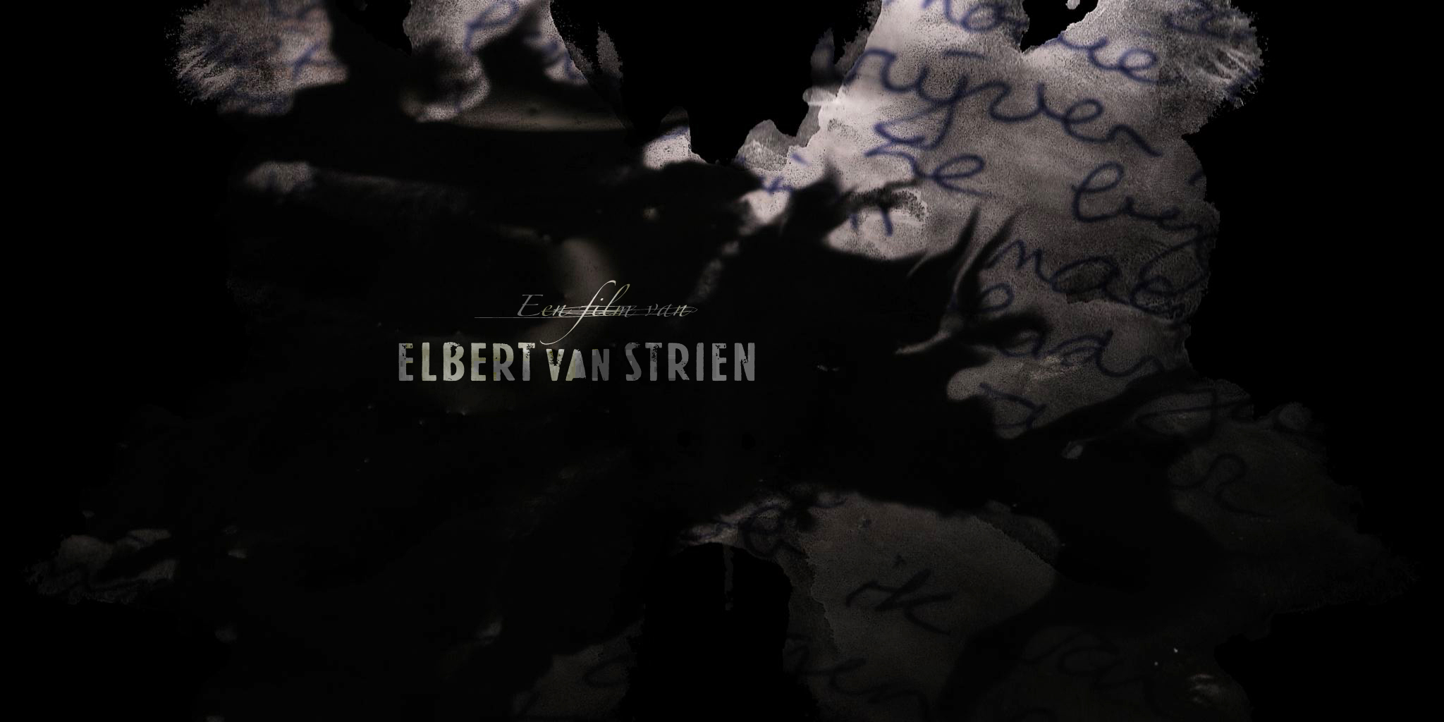
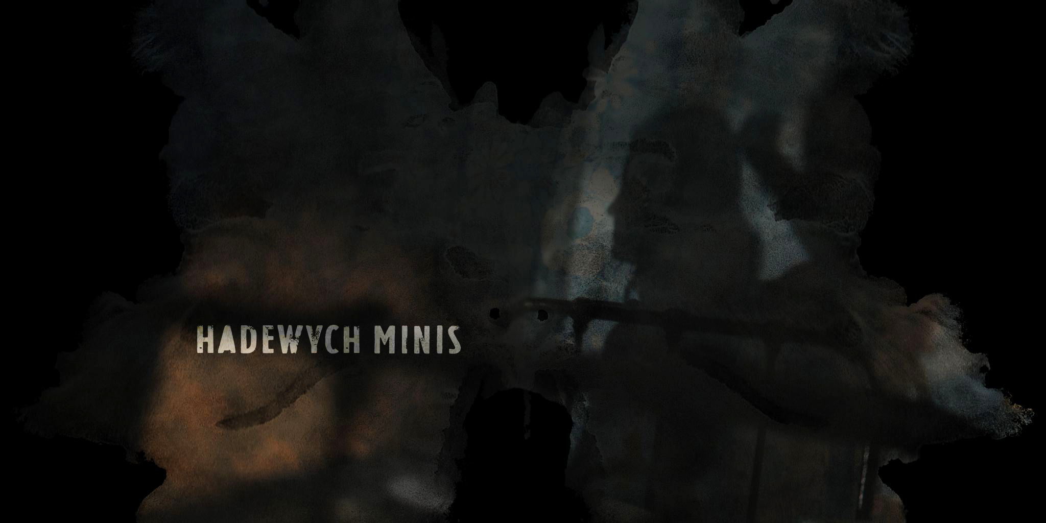
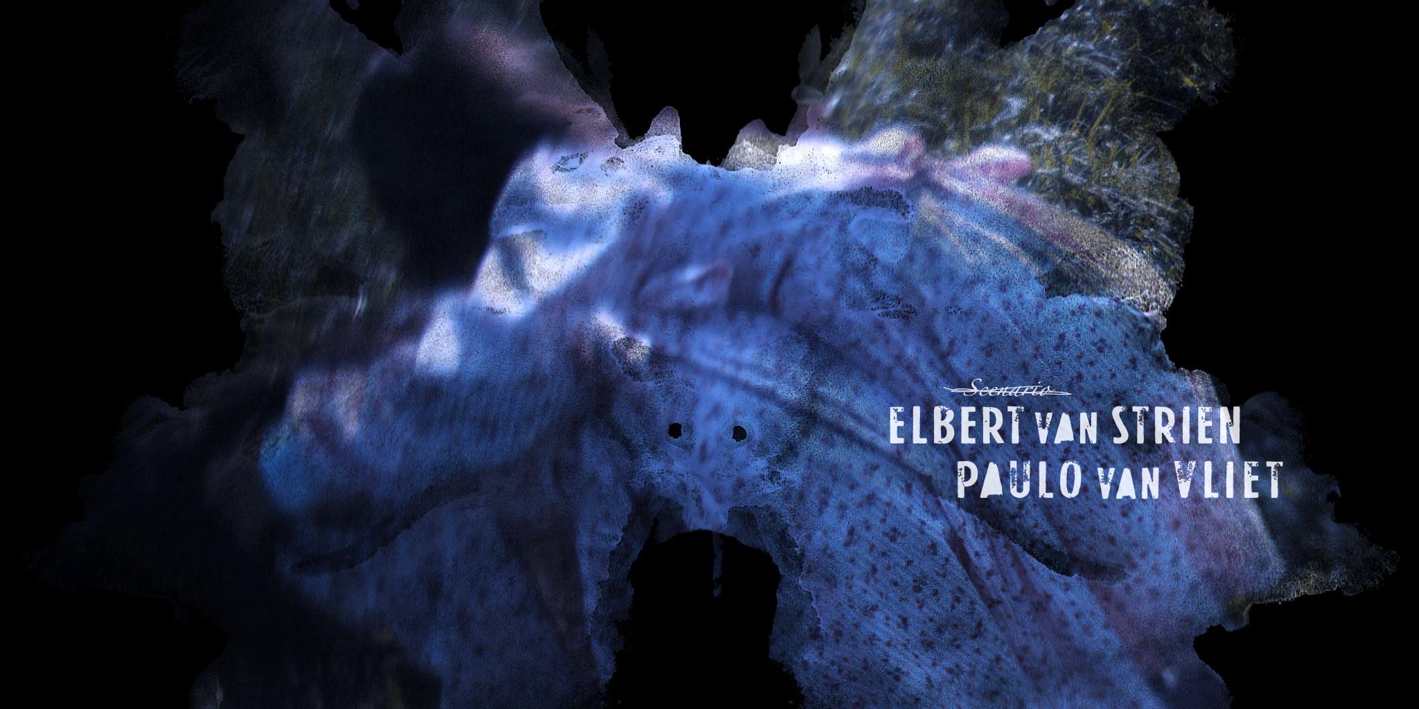
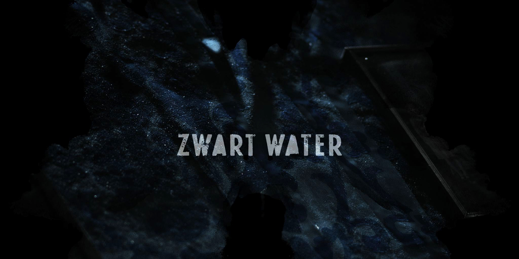
Title design voor feature film Zwart Water, een psychologische thriller van regisseur Elbert van Strien. Deze film neigt iets meer naar het horrorgenre, dus ontwierp ik de titels in die sfeer. In filmland heeft het geen enkele zin om iets 'un-filmlike' te doen, of iets dat het genre niet onmiddellijk herkenbaar communiceert aan het publiek. De speelruimte is heel erg beperkt – dus zelfs de doorgekraste (maar prima leesbare) typografie was een dingetje, maar Elbert, behalve regisseur ook art director van zijn film, durfde het aan.
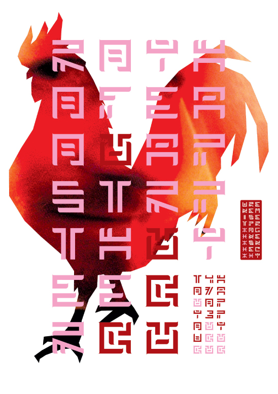
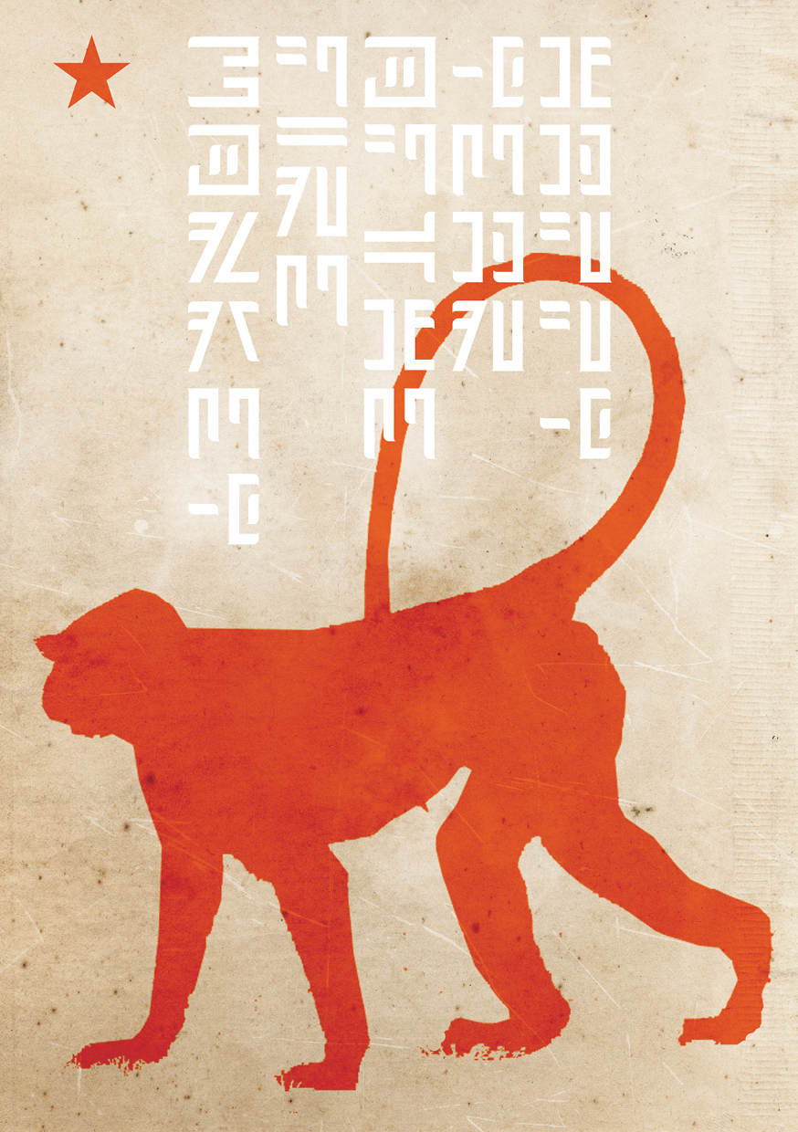
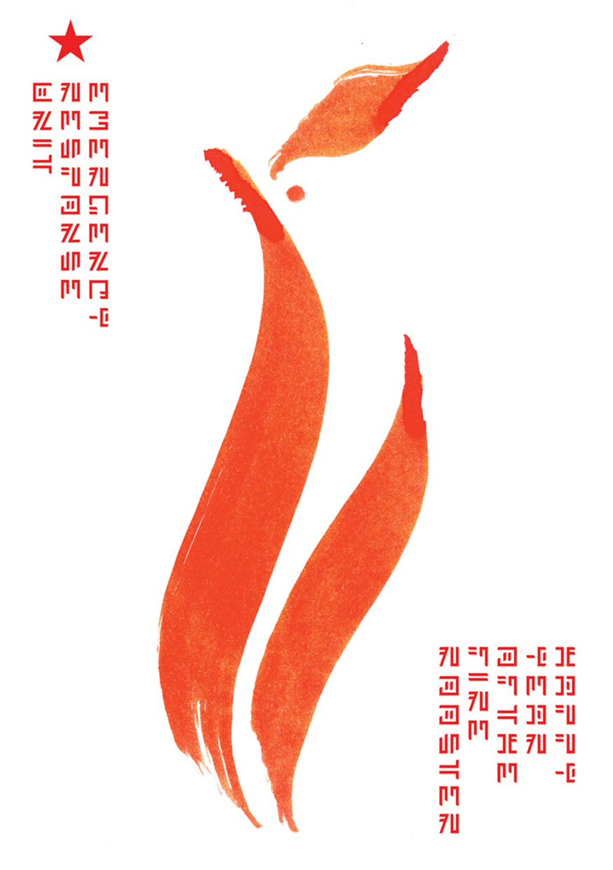
Promotionele Chinees Nieuwjaarskaarten: illustratie, lettertypeontwerp, grafisch ontwerp, en soms copywriting. Want illustraties van dieren zijn veel leuker om te maken dan de zoveelste variatie op de traditionele kerst- en nieuwjaarswensen. En de timing van mijn kaarten viel op: het Chinese Nieuwjaar valt ergens eind januari/begin februari.
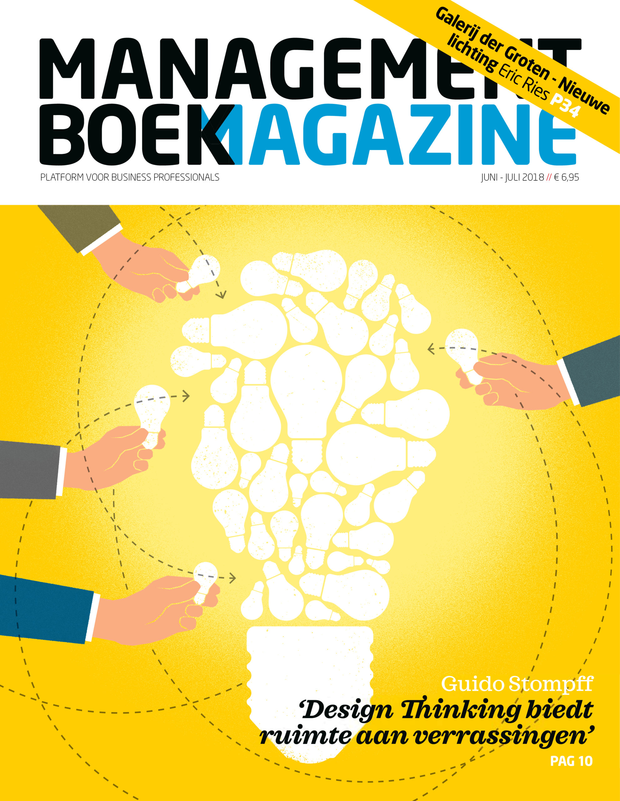
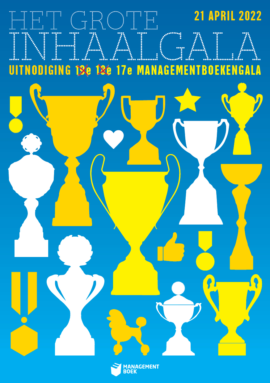
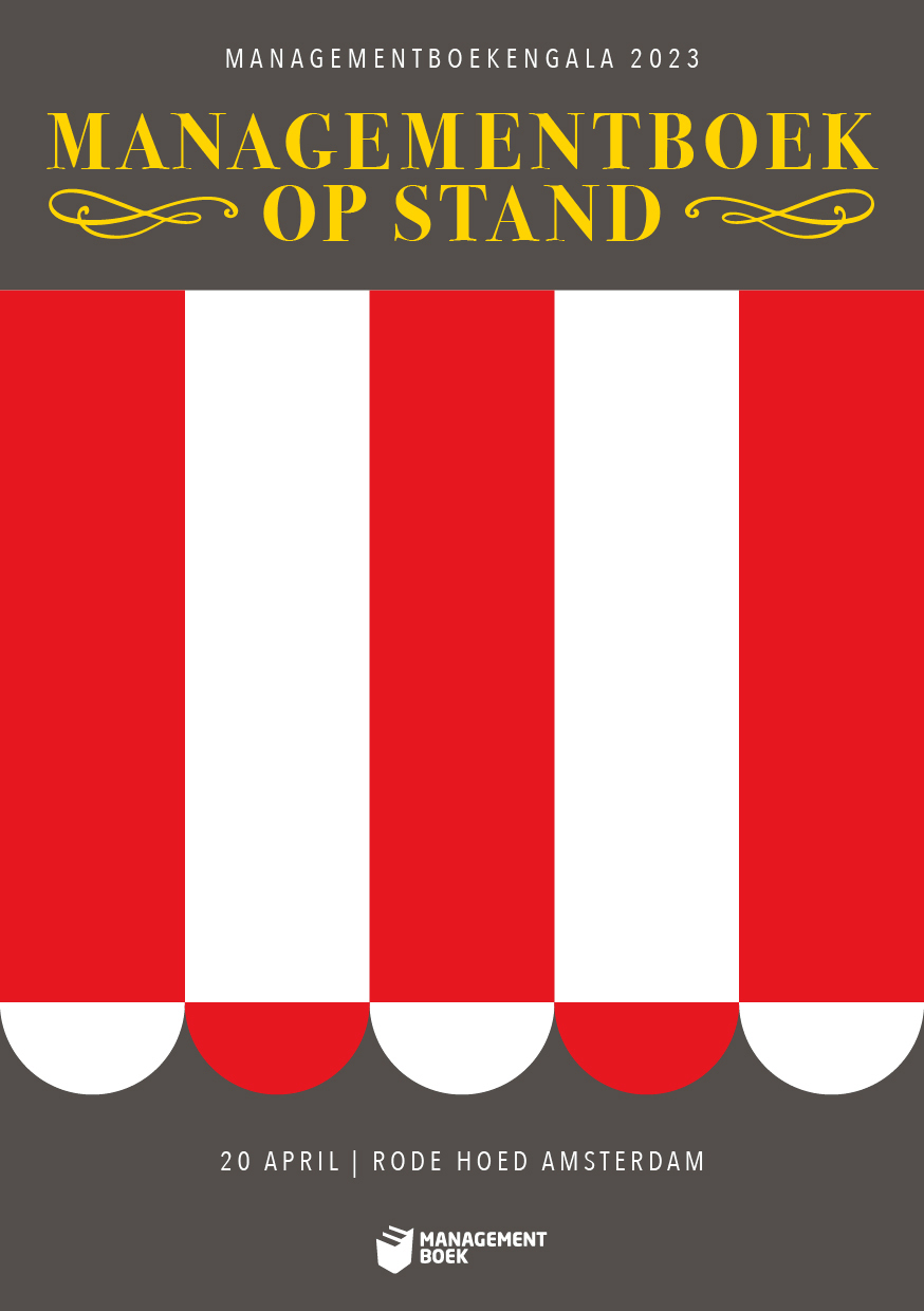
Managementboek: (weer) concepten visualiseren!
Voor Managementboek.nl maakte ik door de tijd heen diverse illustraties. Ook uitnodigingen voor het bekende Managementboekengala nam ik een paar keer voor mijn rekening – leuk werk voor een leuke club mensen!
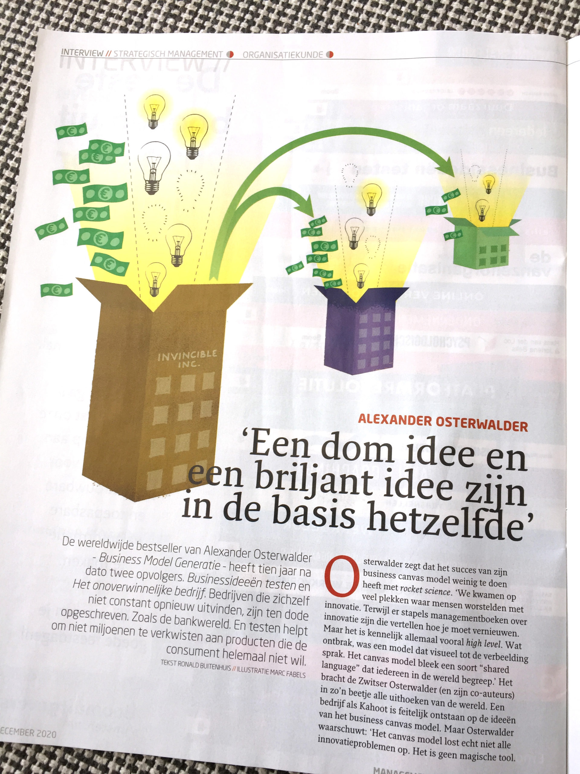
Net als bij Ruigrok in het marktonderzoeksveld, gaat het in de wereld van de managementboeken vaak over abstracte concepten. Dan is het de uitdaging om die concepten begrijpelijk en aantrekkelijk te visualiseren. Daarom gebruik ik altijd een concreet en herkenbaar element, liefst een archetype, waar ik de 'uitleg' aan ophang: instant appeal is belangrijk om de kijker überhaupt te laten kijken en de kans op begrip te vergroten.
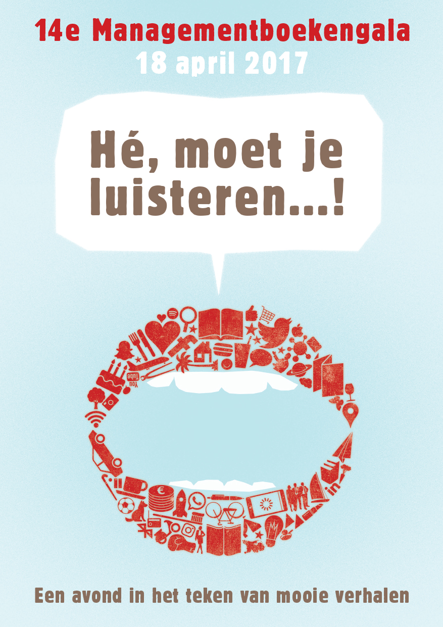
Voor de Managementboekengala's zijn de thema's duidelijker (en altijd ijzersterk). En dan is het juist de kunst om het cliché te vermijden! Al was het maar, omdat dat helemaal niet bij Managementboek past. En dat is vermoedelijk waarom ze me dan toch weer bellen. Leuke club, zei ik dat al?
Managementboek: (weer) concepten visualiseren!
Voor Managementboek.nl maakte ik door de tijd heen diverse illustraties. Ook uitnodigingen voor het bekende Managementboekengala nam ik een paar keer voor mijn rekening – leuk werk voor een leuke club mensen!
Net als bij Ruigrok in het marktonderzoeksveld, gaat het in de wereld van de managementboeken vaak over abstracte concepten. Dan is het de uitdaging om die concepten begrijpelijk en aantrekkelijk te visualiseren. Daarom gebruik ik altijd een concreet en herkenbaar element, liefst een archetype, waar ik de 'uitleg' aan ophang: instant appeal is belangrijk om de kijker überhaupt te laten kijken en de kans op begrip te vergroten.
Voor de Managementboekengala's zijn de thema's duidelijker (en altijd ijzersterk). En dan is het juist de kunst om het cliché te vermijden! Al was het maar, omdat dat helemaal niet bij Managementboek past. En dat is vermoedelijk waarom ze me dan toch weer bellen. Leuke club, zei ik dat al?
Zowel schrijven als grafisch ontwerpen voor Archiprix. Ik kreeg een stapel (digitaal) papier met de contouren en ideeën voor een samnwerkingsprogramma, een boot camp, voor jonge architectuurstudenten. Ik structureerde het en schreef het tot een coherente en enthousiasmerende pitch voor een fondsenverstrekker. Archiprix had wel een soort van visuele identiteit, maar ik nam en kreeg de vrijheid om die te updaten, om de nieuwe spirit van de organisatie uit te drukken.
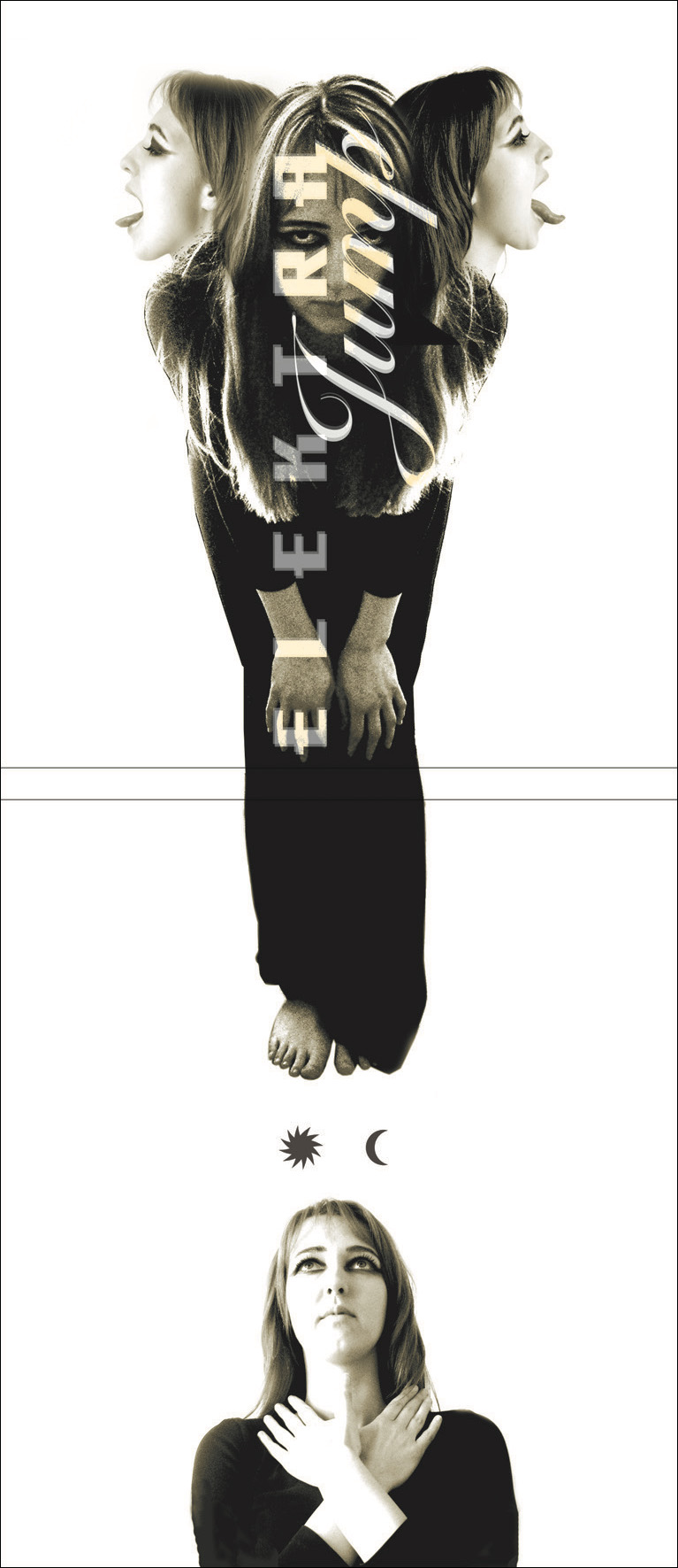
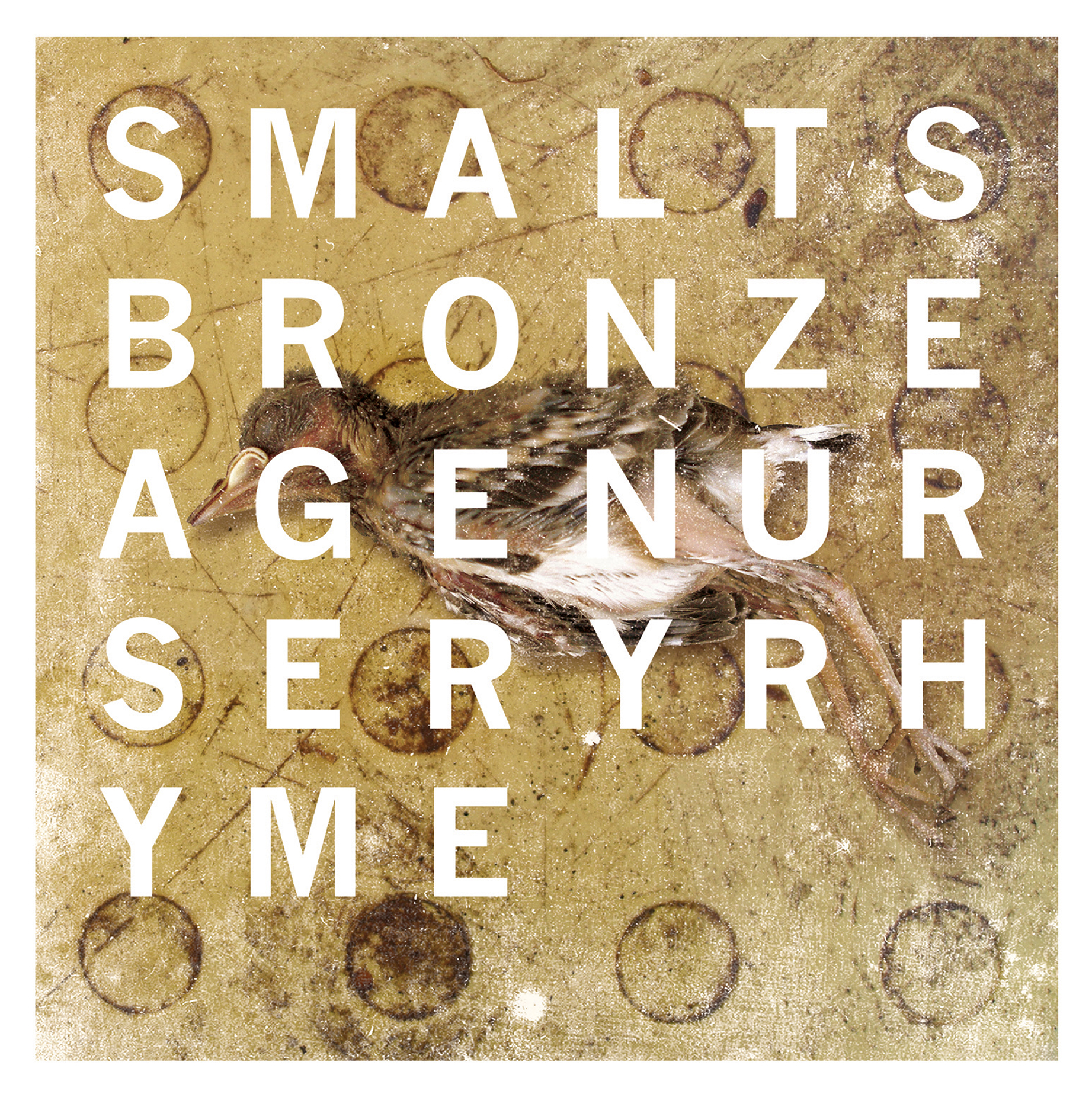
CD (en vinyl) albumcover-ontwerpen. Voor het ontwerp van Elektra/Jump schoot ik zelf de foto's, intuïtief wetend dat ik meerdere foto's zou gaan samenvoegen. Dus lette ik ook op geometrie... Voor het ontwerp van Smalts gebruikte ik twee verschillende foto's uit mijn inmiddels zeer omvangrijke je-weet-nooit-of-je-nog-eens-een-foto-nodig-hebt-van-(...)-archief...
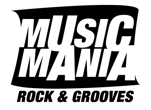
Logo-ontwerpen. Music Mania is van rond 1998, nog steeds op de ramen van deze gekende Gentse platenzaak (gecheckt). De tweede is uit 2009, ook nog steeds in gebruik. De derde, uit 2002, is maar kort gebruikt; het bedrijf was er misschien wel te vroeg bij. Maar goed: geen briefings indertijd, gewoon een goed gevoel voor wat er nodig was, een scherp oog, een vaardige hand – en heel veel plezier in het maken.
En natuurlijk: faits divers!
En natuurlijk: faits divers!
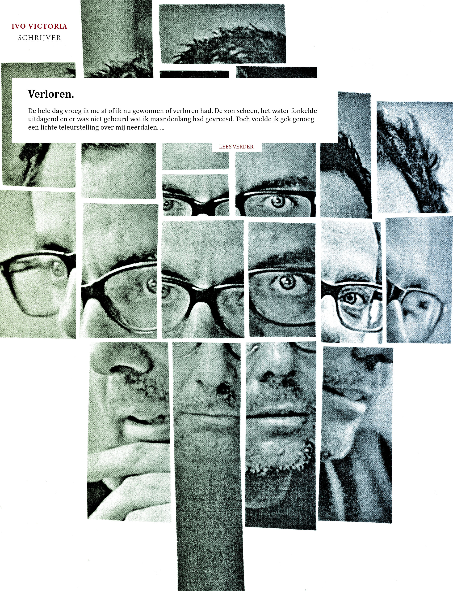
Web design en collage-illustratie voor schrijver Ivo Victoria (ivovictoria.com)
Concept / illustratie / grafisch ontwerp
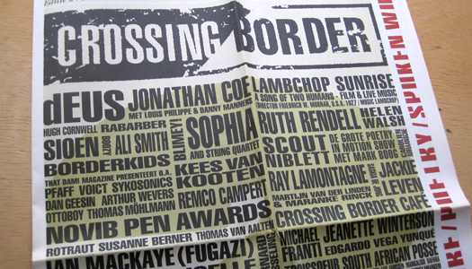
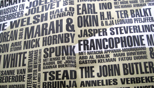
Concept / grafisch ontwerp / typografie voor de programmakrant van Crossing Border (met Spacebar / Robert Muda van Hamel)
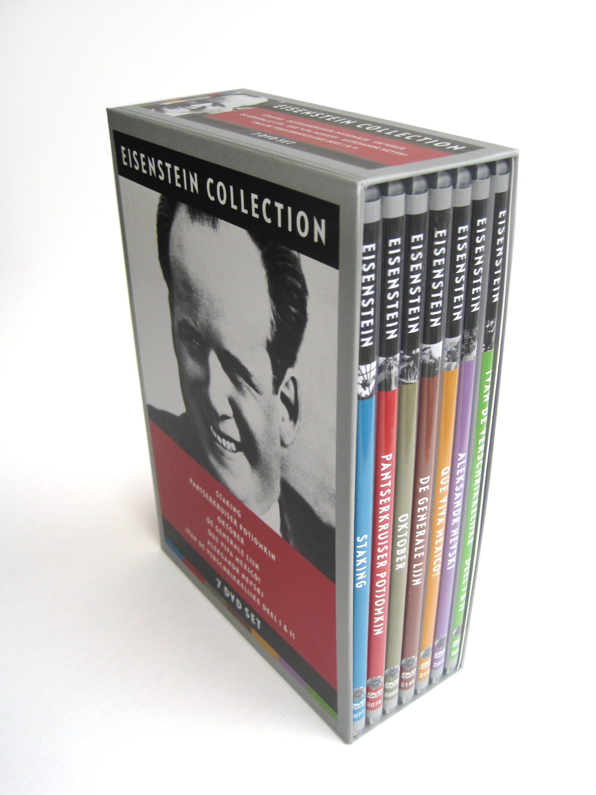
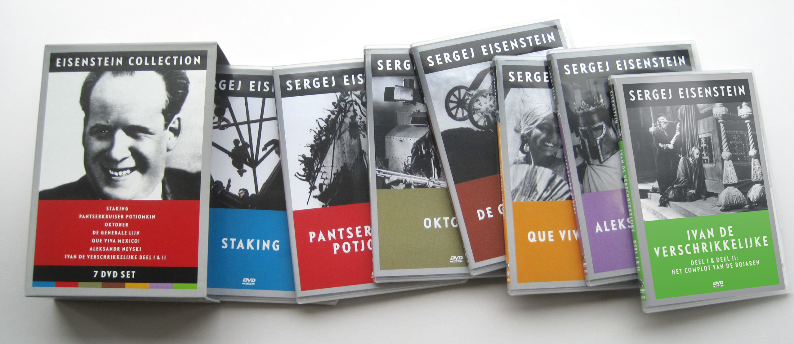
Concept / grafisch ontwerp / typografie van de Eisenstein Collection DVD Box Set, voor Moskwood Media. Van 2000 tot en met 2012 heb ik meer dan honderd dvd-inlays voor klassieke, bijzondere en obscure Russische, Oost-Europese, Euraziatische en Midden-Oosterse films ontworpen.
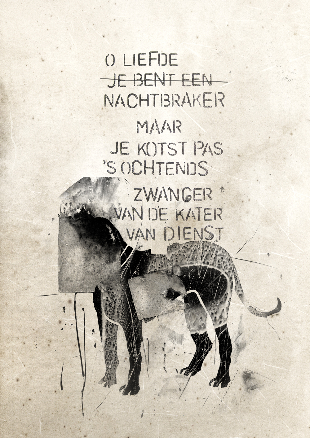
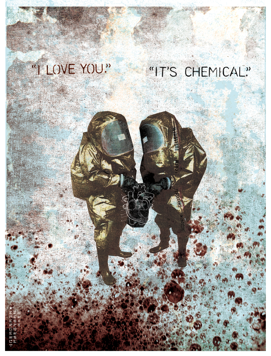
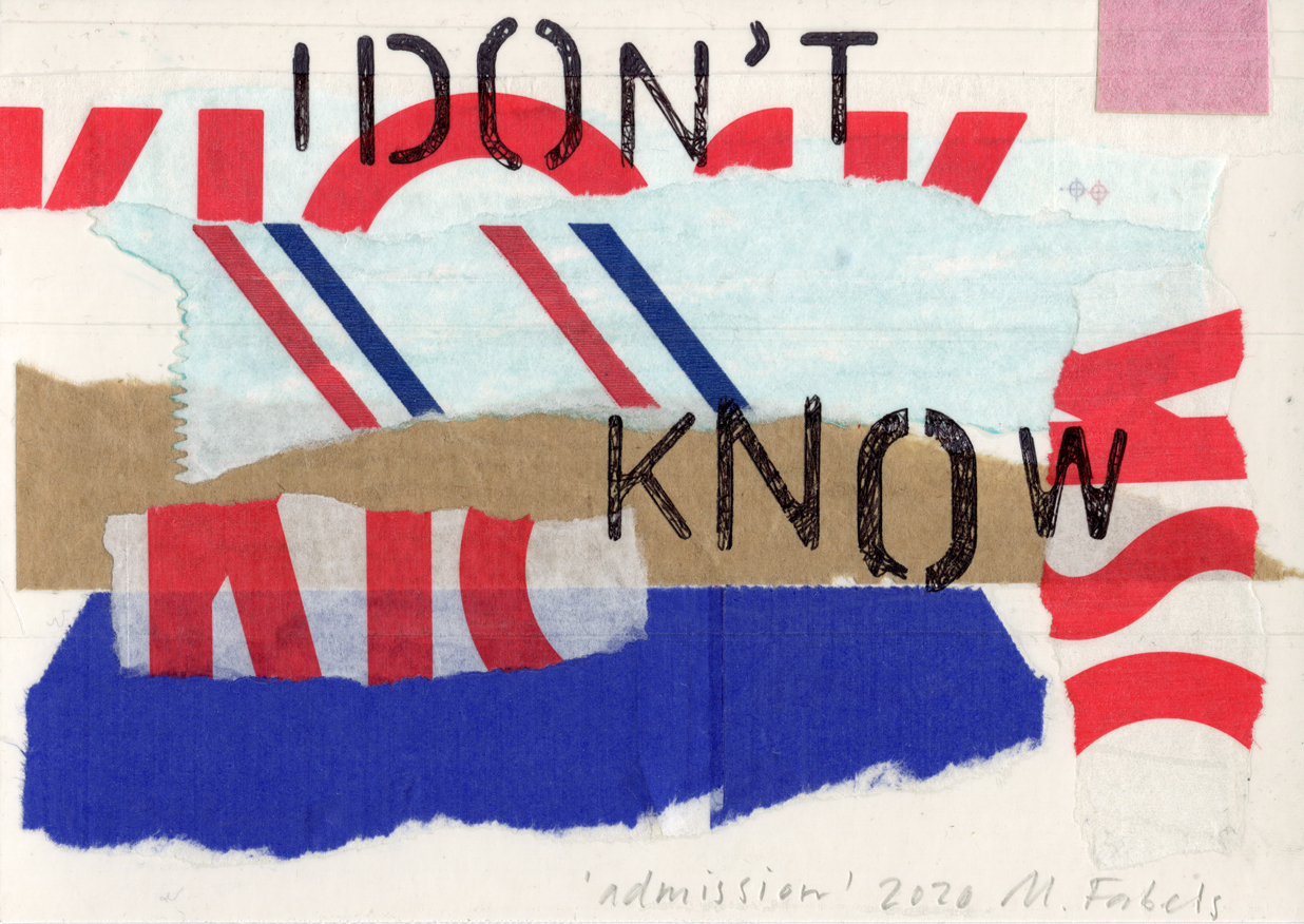
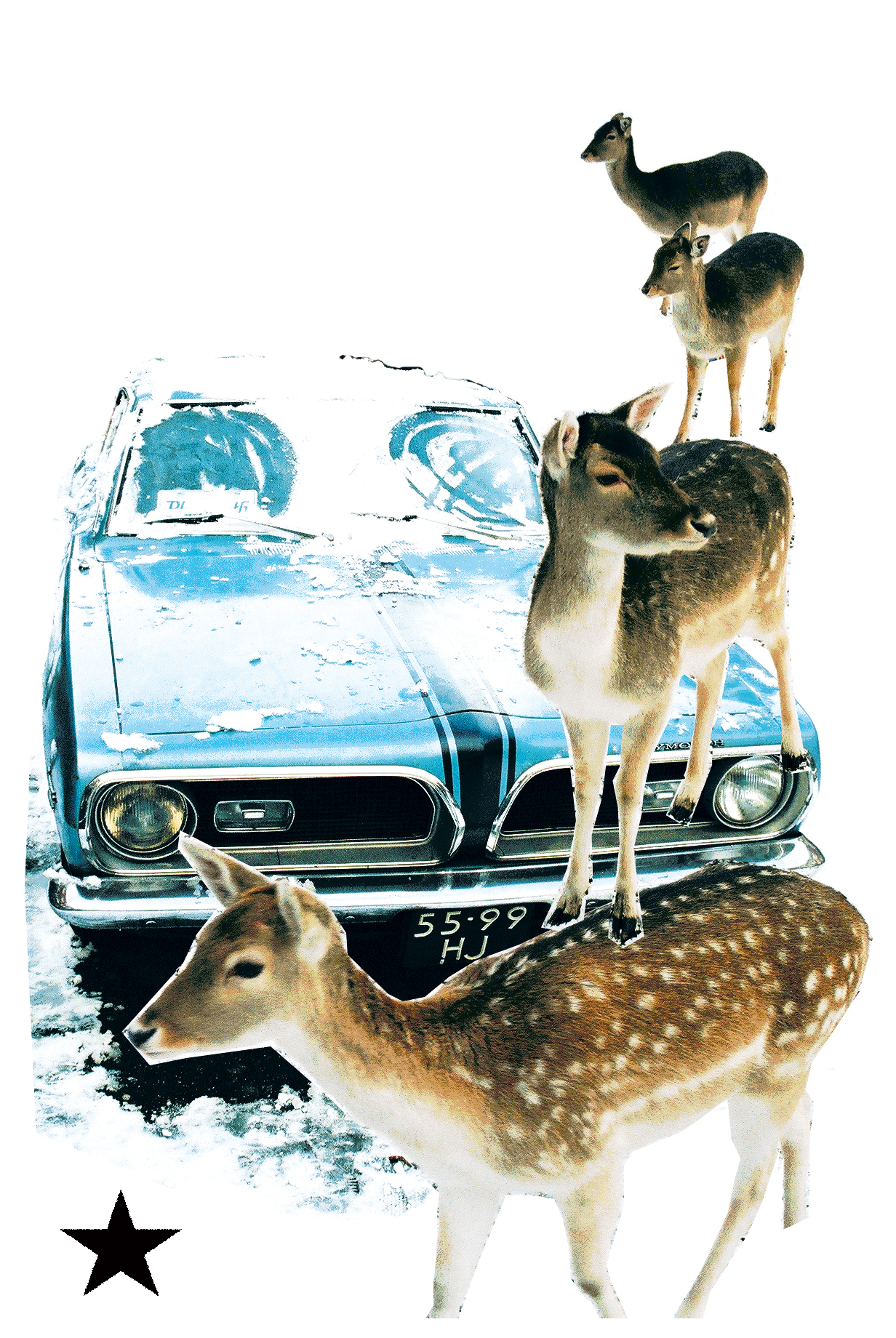
Eigen digitale collages, handgemaakte typografie.
Inzending voor een tentoonstelling door en voor Haagse ontwerpers en ontwerpbureaus.
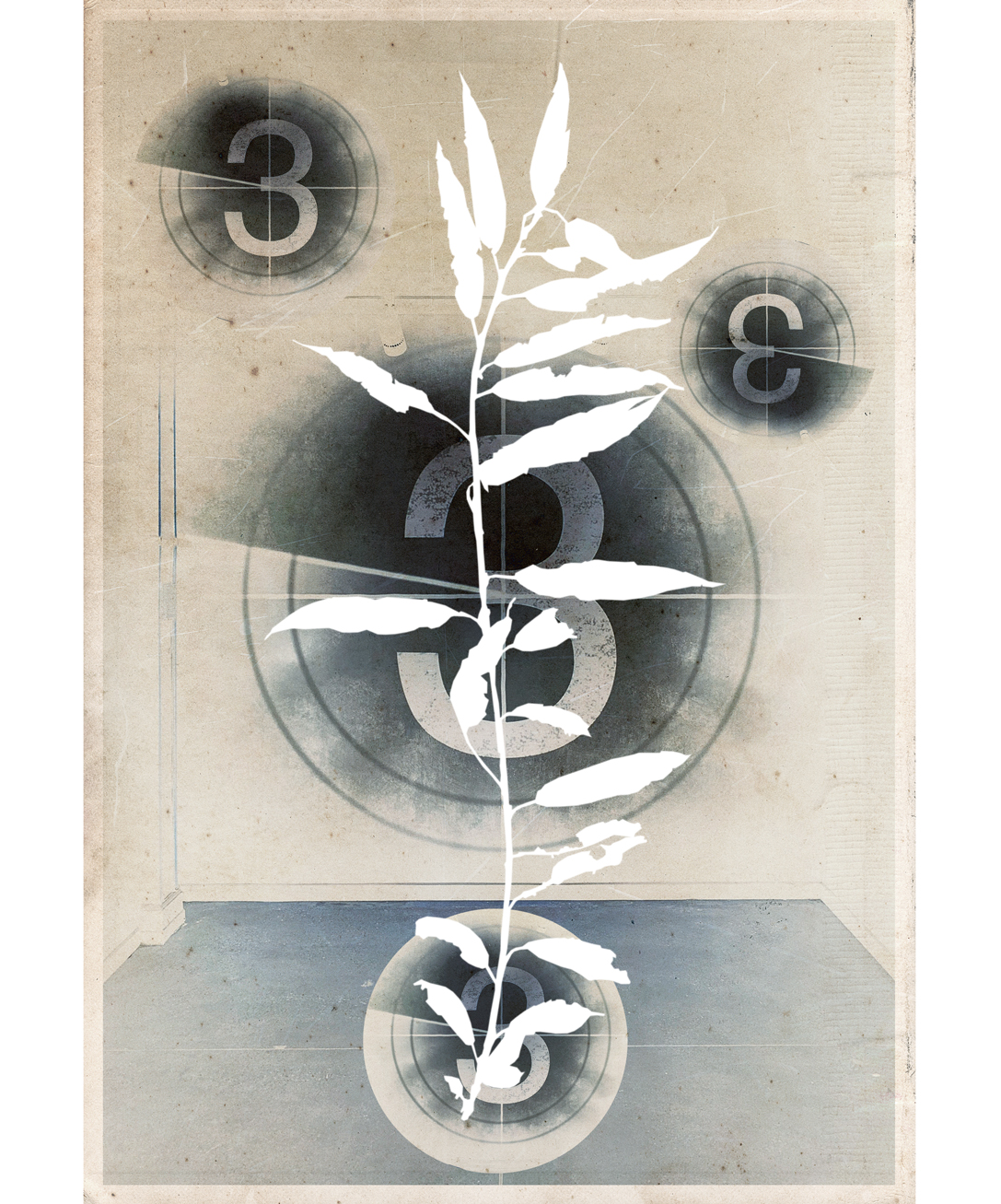
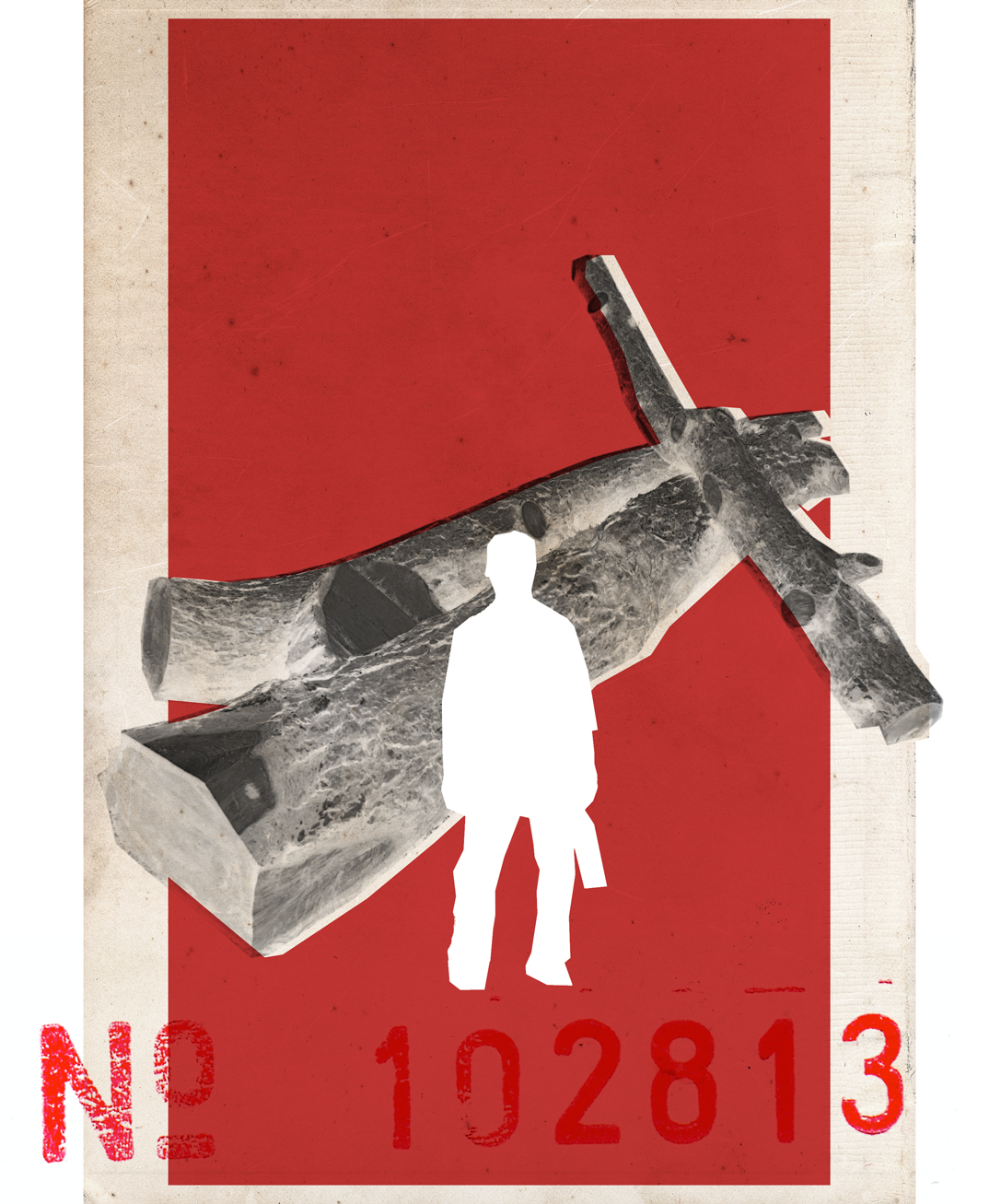
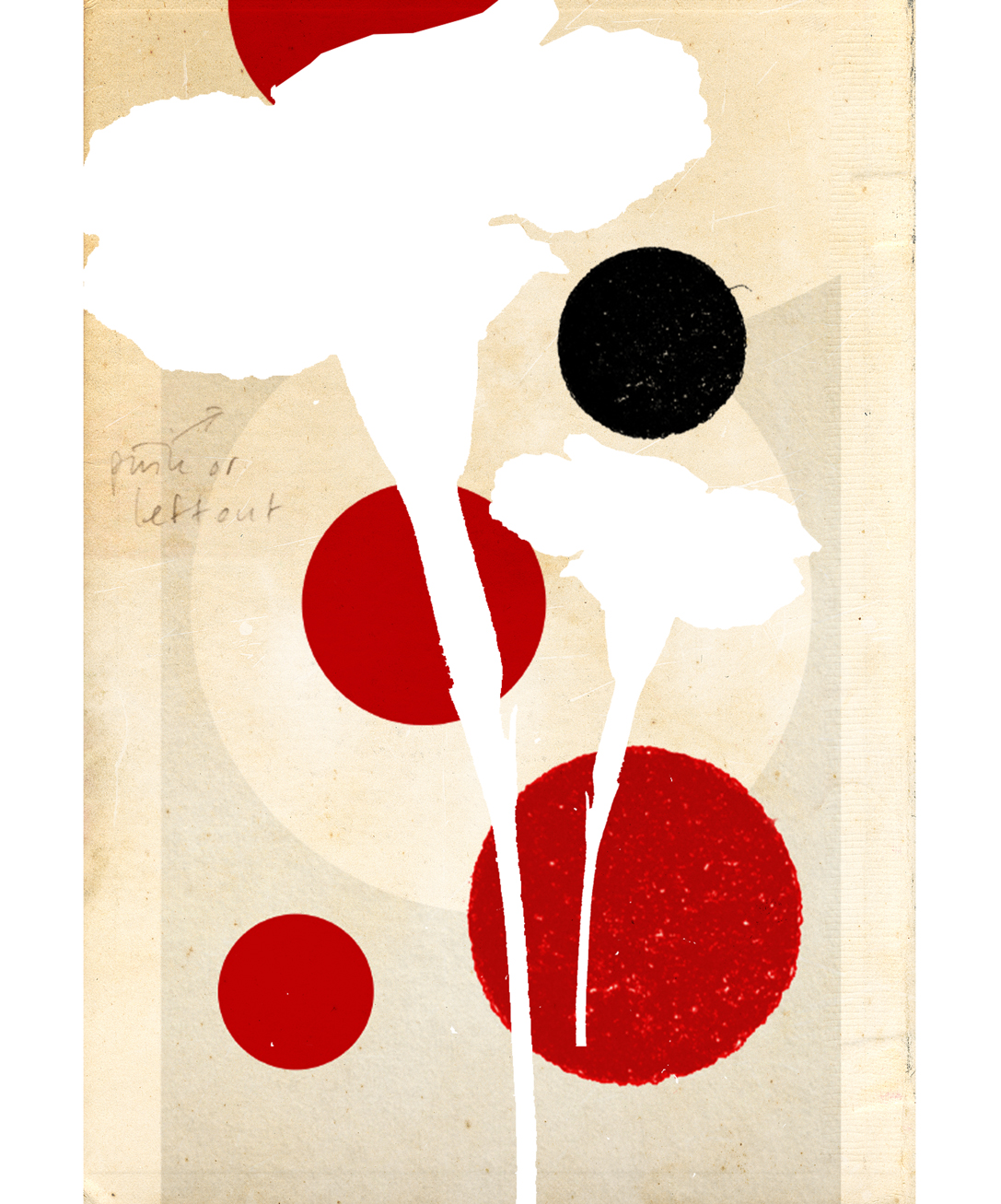
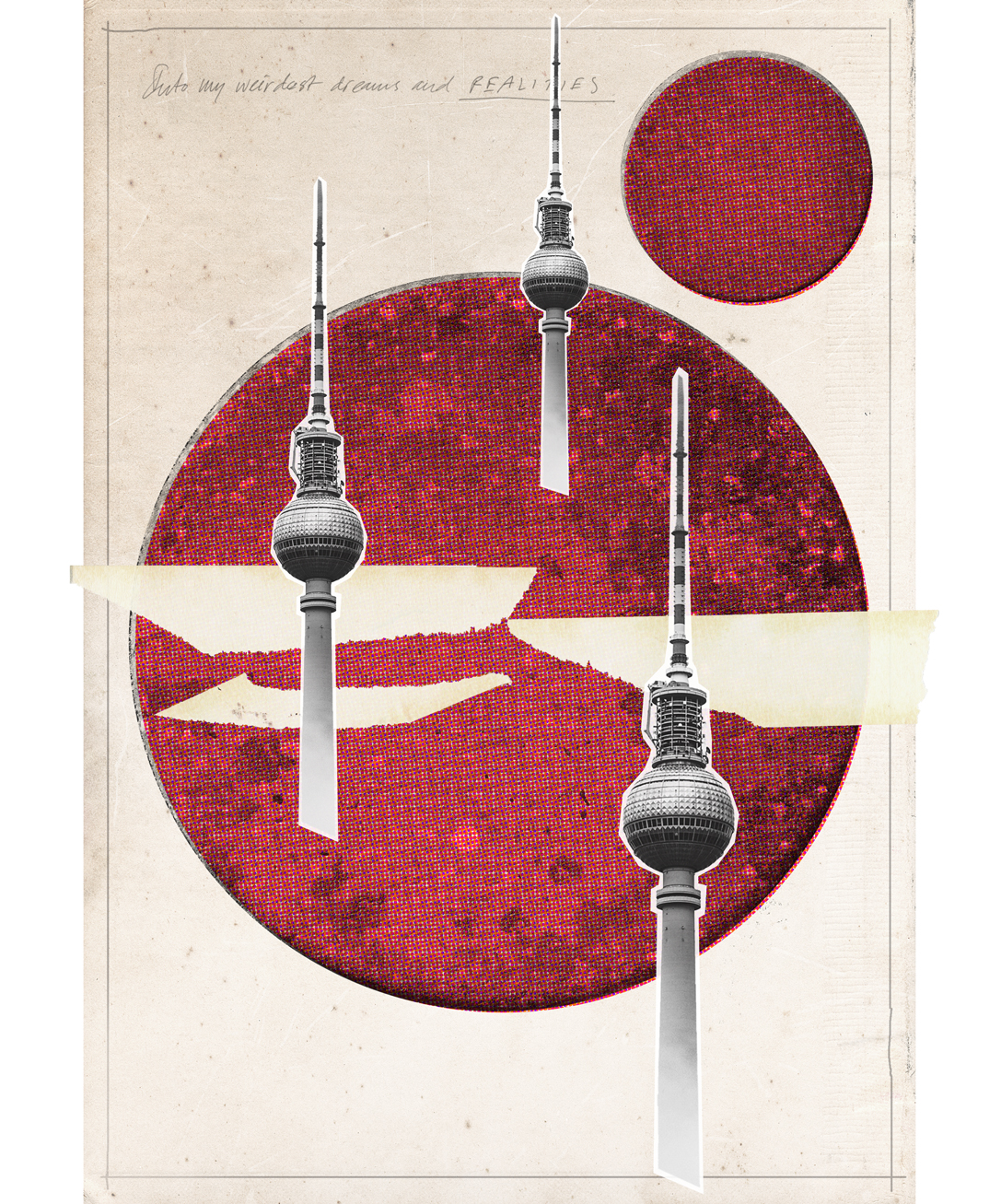
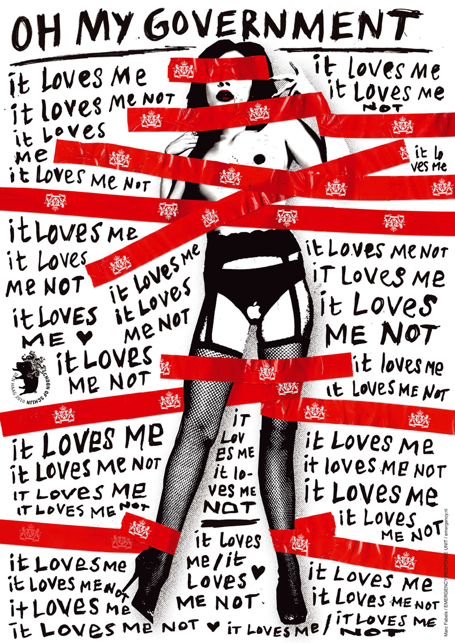
Digitale collages voor de Paris Collage Collective-challenge.
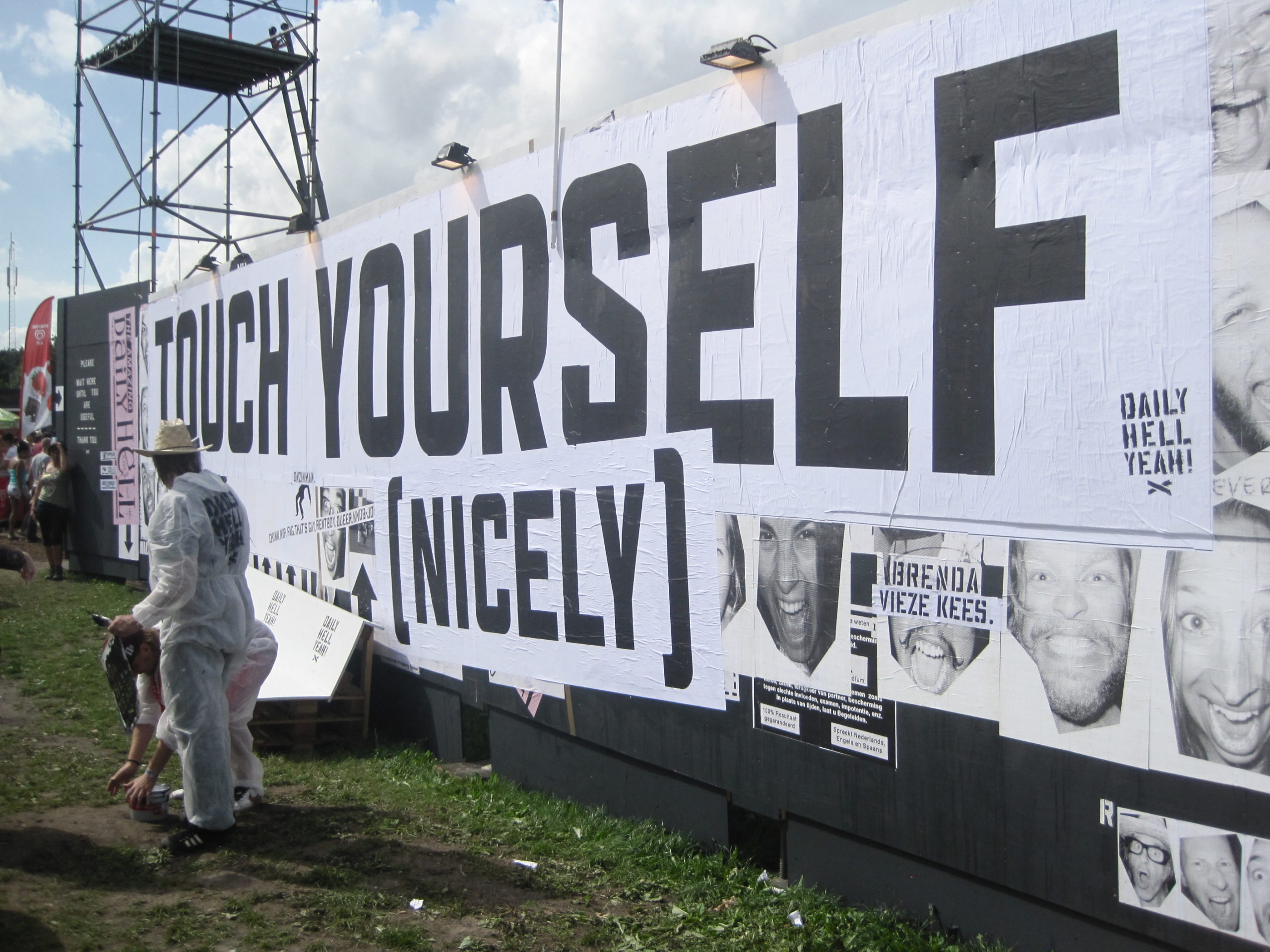
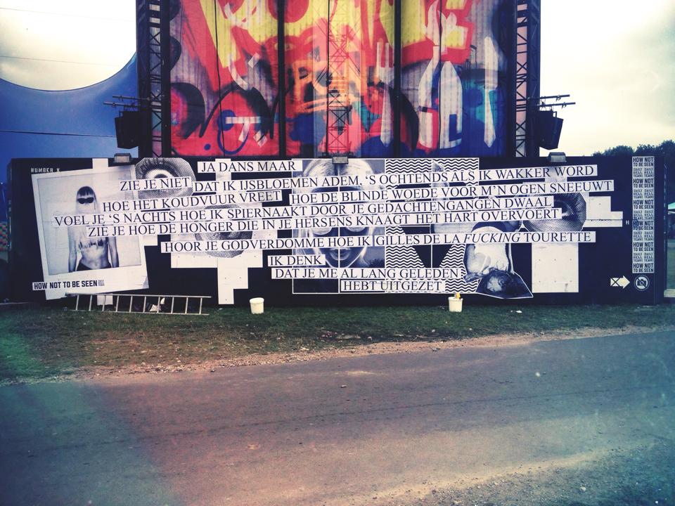
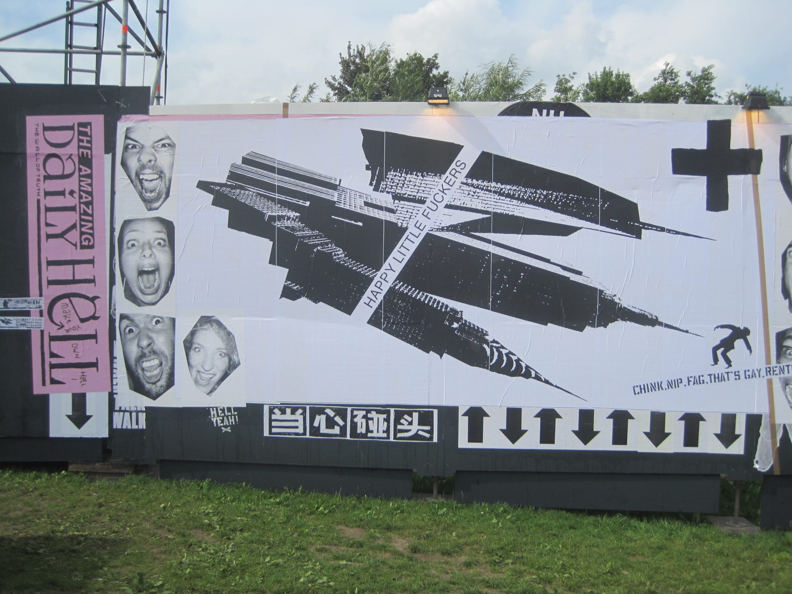
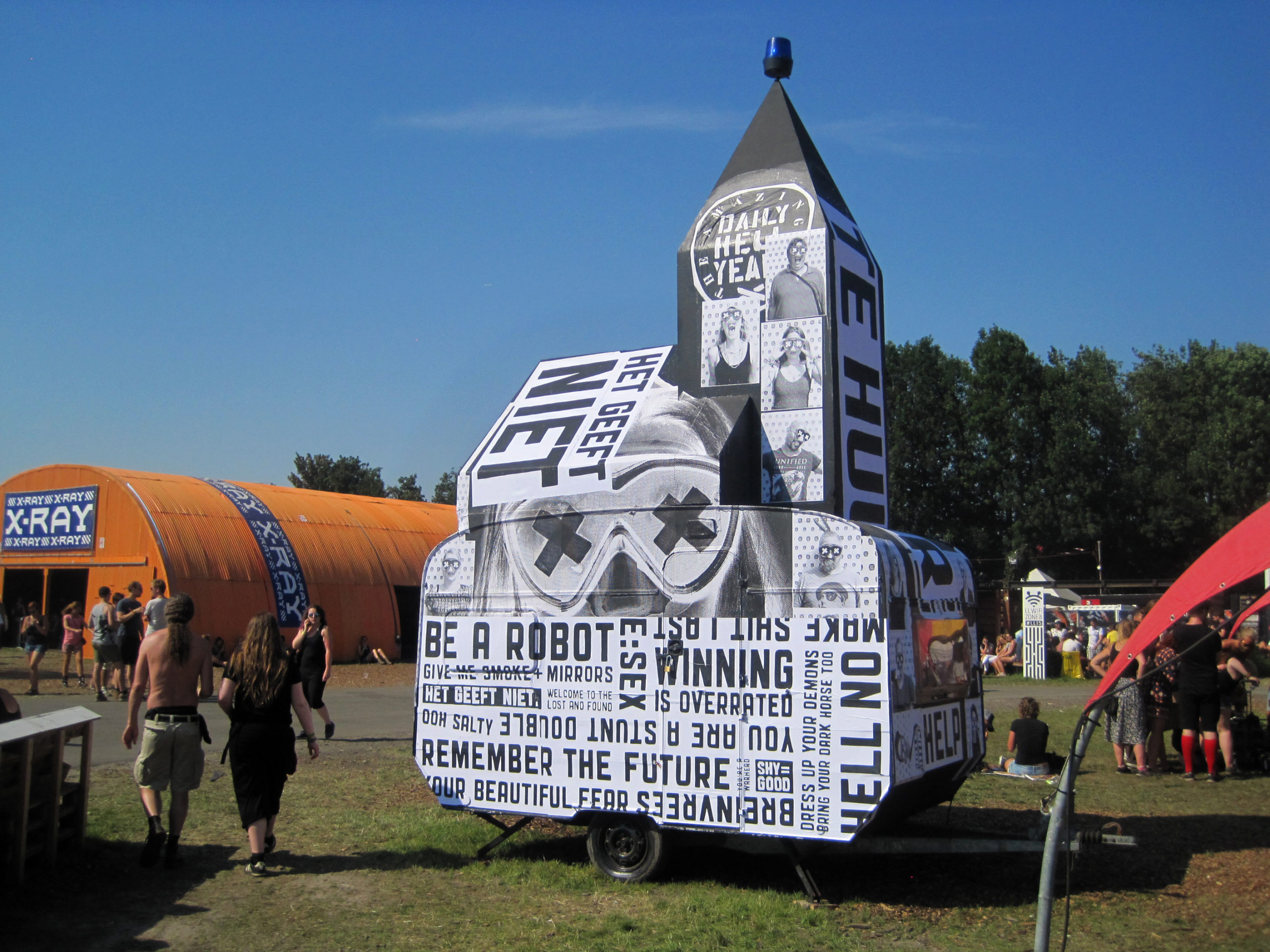
The Amazing Daily Hell - kunstprojecten op het Lowlands festival (geïnitieerd door Peter te Bos, ook met fotograaf Lo Andela) – mijn bijdragen waren illustratie, ontwerp en schrijven.
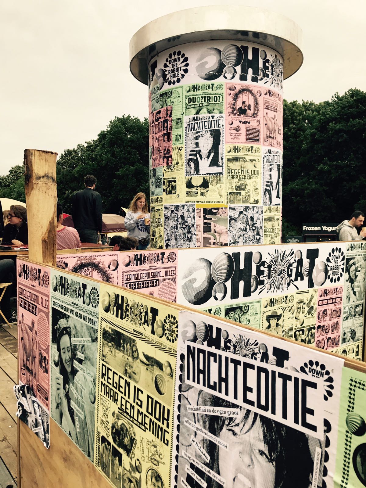
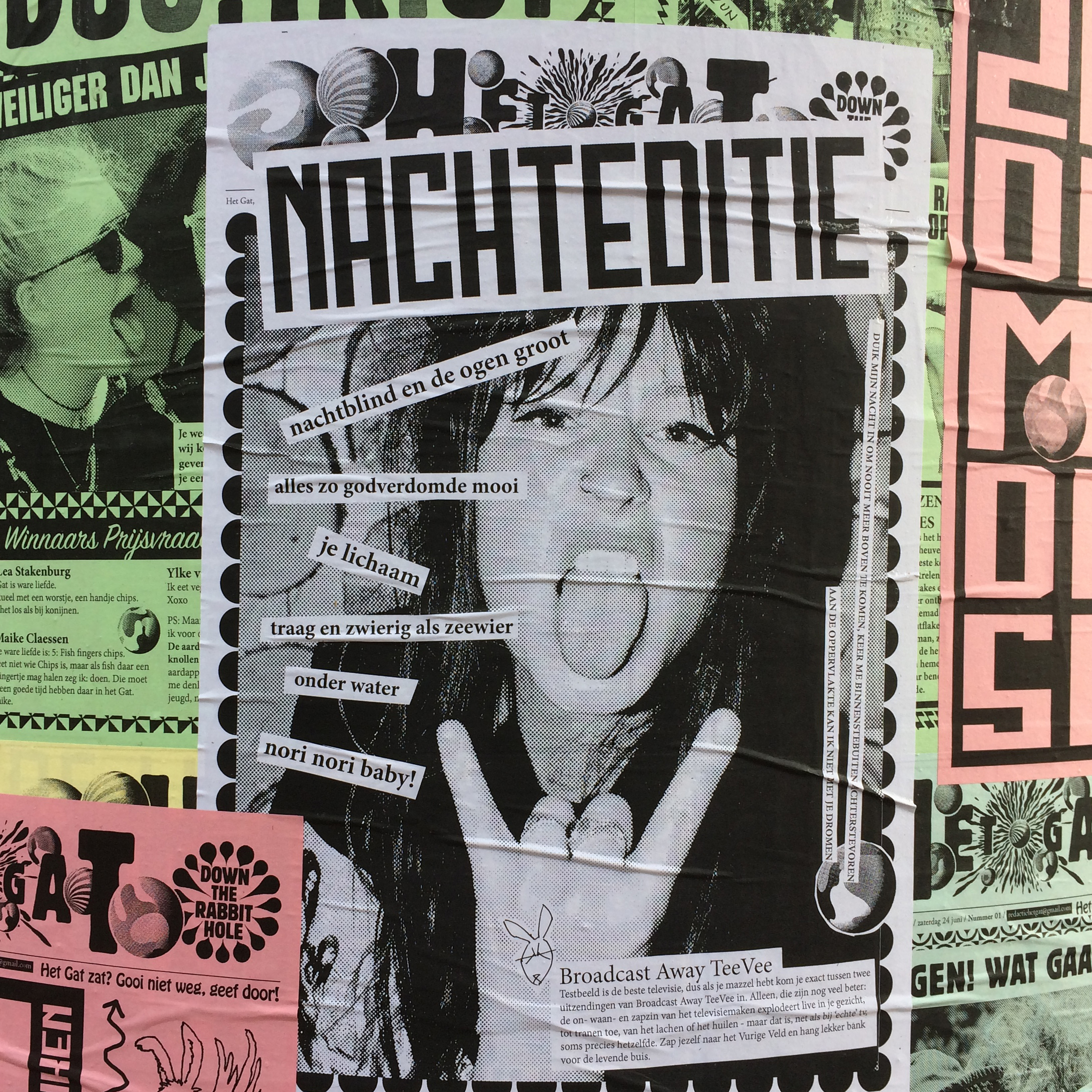
Het Gat - live gemaakt festivalmagazine op Down The Rabbit Hole. Het eerste en enige losbladige festivalmagazine ter wereld!
Met Peter te Bos, Lo Andela, Pascal Tieman. Schrijven, copywriting, redactioneel en: social media manager, toen dat nog helemaal geen naam had. Yeah!
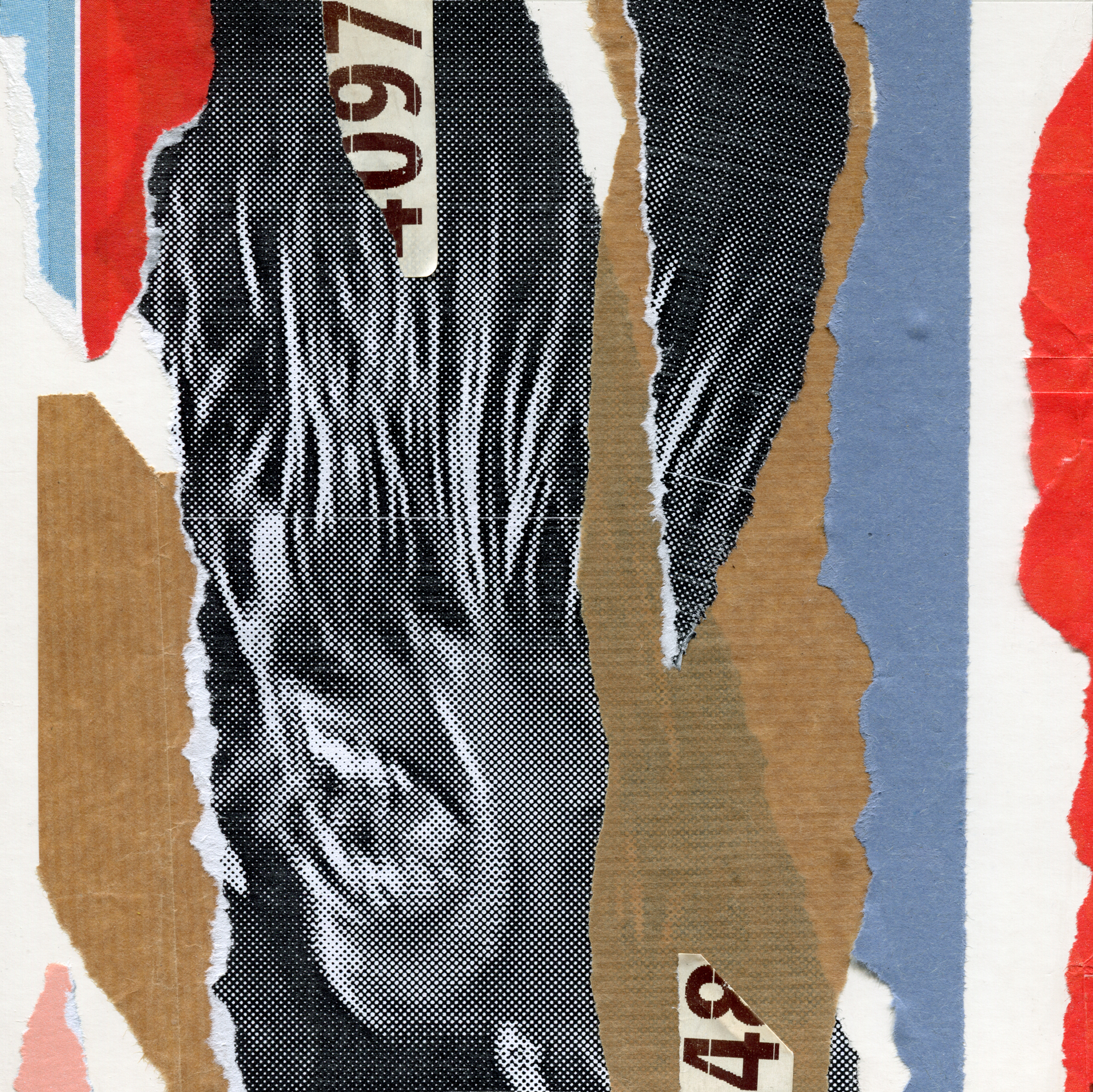
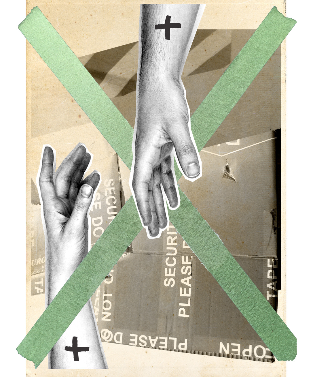
Analoge collages, gewoon, omdat het kan.